One of the more exciting parts of launching a new business is your branding. Or maybe I’m biased? 🤪
Your branding is the visual and emotional element of your business. How does a potential client see you? Are they able to recognize you on any platform? How do they feel when they see your content?
To start, your brand includes your colors, fonts, and overall vibe. Once these elements are lined up, you can start to think about your logo. You may think your logo is the first element, but I’d argue that it’s best to get a more well-rounded idea of your brand before you settle into a logo.
The case for launching your business with a DIY logo
If you’re starting out, it may be intimidating to think that you’ll have to shell out $$$ to hire a pro for your branding and logo. BUT in my opinion, you’re better off DIYing your brand and launching before you invest in an expert designer. Why? A couple of reasons: On one hand, when you’re first starting out, there’s a lot that needs to develop before you feel settled into your business. Investing in professional branding too early may mean a rebrand in the future. Instead, if you take the time to get to know your business and yourself as a business owner, you’ll feel more confident once it’s time to invest.
On the other hand, it’s quite common to try and have it all perfectly together before launching. And yeah, a nice brand and pretty logo feel great, but if they’re the reason you’re putting off getting out there, they’re costing you time, money, and energy.
So if you feel like you can’t launch without everything being perfectly in place, take this as your sign to launch as-is. This is what I’d call a slim launch – launch with what you have and then build and improve on it as you’re able.
How to make a logo for your business
Find artistic inspiration
Once you decide to start your logo design, browse through sites like Pinterest or Creative Market to find inspiration. Now, it doesn’t have to be specifically logos. You can find art that you like in whatever media you prefer like inspirational typography, watercolors, mid-century illustration, minimalist line drawings, etc.
Also think about the types of art you’ve liked in the past. Maybe you love old-school comics or Andy Warhol’s paintings? Or think about brands that are memorable to you. Save all of these as references for when you’re ready to dive into the design phase.
Do a braindump
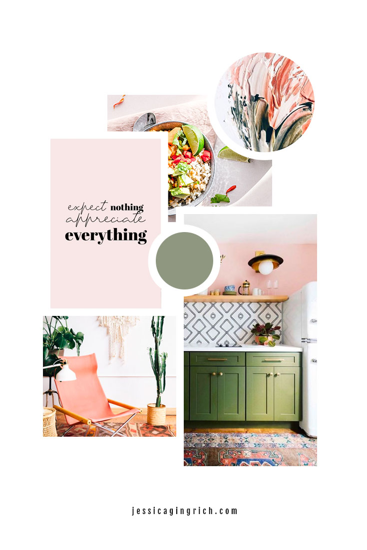
Get all your ideas out on paper (or a Google doc) and let your imagination flow. If you’re into collages, you can try one with your favorite elements. This is called an inspiration or mood board.

Find fonts that speak to you and test them with your business name (head over here if you haven’t picked a business name yet), play with geometric shapes, pair colors together and generally experiment with the elements you found in your research.
Where to look for fonts? Check out google fonts for free options and Creative Market for paid options! Canva also has a library of free and premium fonts you can utilize!
Discard most of your ideas
Once you’ve laid it all out, it’s time to get rid of the stuff that doesn’t work. Maybe a color combination you thought would look great and ended up flopping, or a font that’s too hard to read.
The goal is to keep 3-5 ideas that actually work together and leave the rest behind.
Consider a font-based logo
Many times, it’s easier to start with a font-based logo than with other graphic elements or shapes. But you don’t need an icon to get started – your logo can evolve and be refined to include other elements once you’re ready.

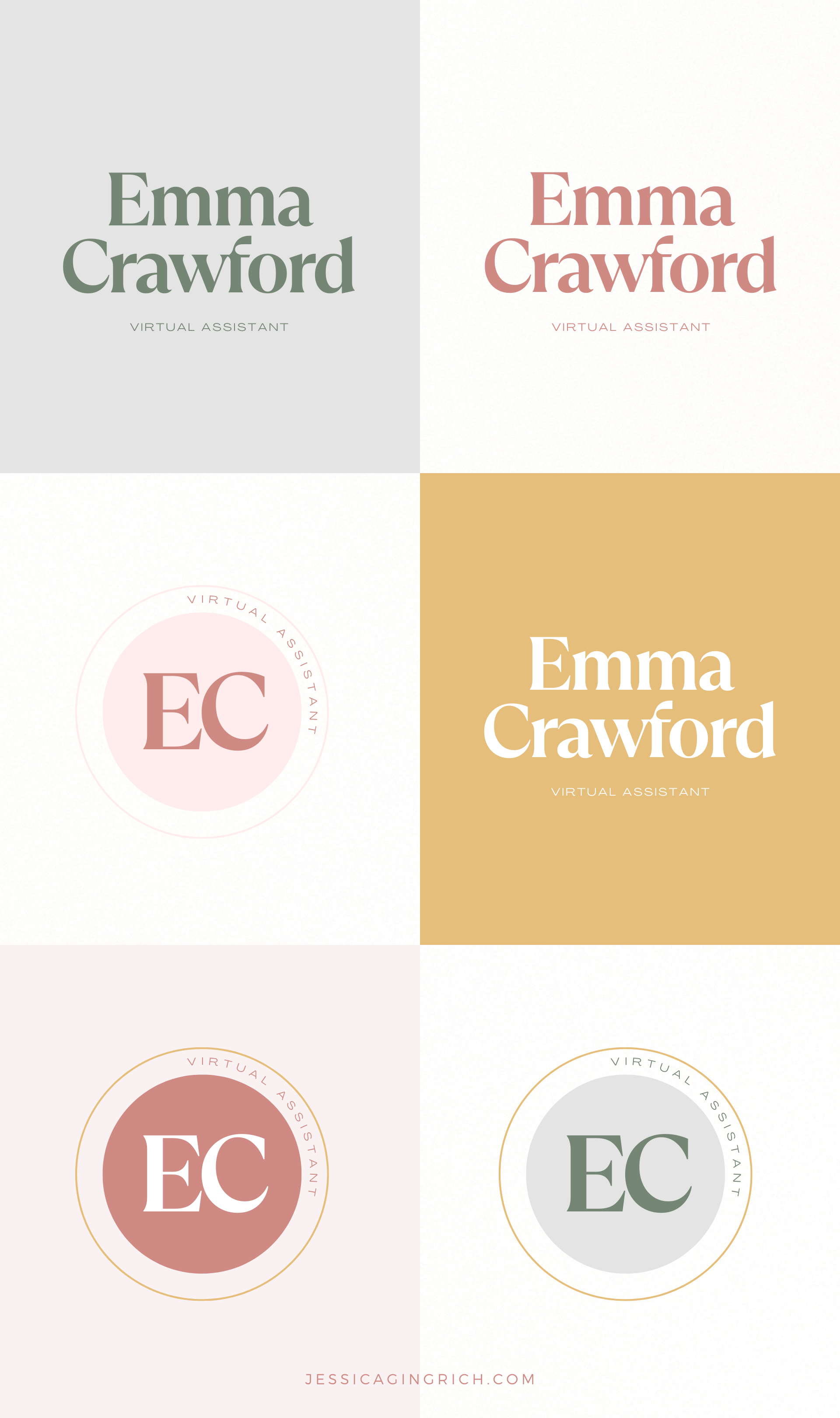
To do a font-based logo, simply type your name in a Google or Canva doc and play around with different fonts until you find something you like. You can add a simple accent shape or mix different fonts if your business name has different parts (like your actual name and a description of what you do – Jane Doe – Design Studio).
When in doubt, keep things simple
If you’re feeling overwhelmed by too many options, pare it down even further. Choose 2-3 of each:
- Fonts
- Graphic elements (geometric shapes and other elements)
- Layouts (rounded, rectangular, etc)
- Colors (or color combinations)
With these final options, mix and match until you find something that feels good for you. Keeping things simple will also help if you have little experience with tools like Canva. A beautiful font with a simple background and a decorative element will be a perfect starting point.

Final tips for a DIY logo
A lot of times, finding inspiration in places like Pinterest means you’re attracted to trends. But it’s best to choose something that feels more timeless and not super trendy because it’s going to age really quickly. Hot tip: If you’re seeing it everywhere, stay away from it. Otherwise, you run the risk of looking like everyone else’s IG account.
Another important thing is to keep it simple and use 1-2 colors tops. And remember, it’s fine to use black and white, too. Not every logo or brand has to be super colorful. And you’ll want to have a version that works on a darker background as well as your regular logo.

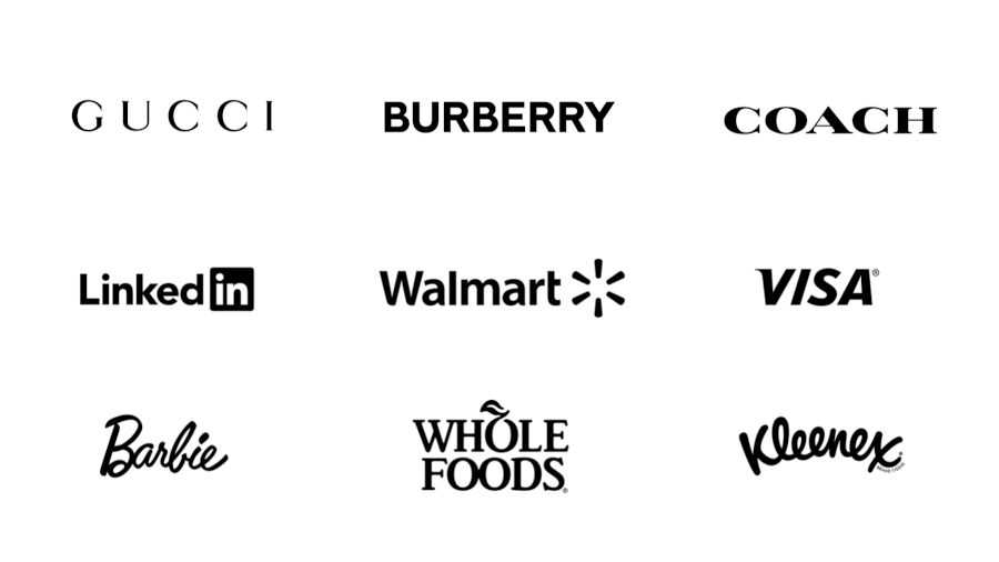
Next, remember to keep things minimal. Your logo is not meant to be a super detailed portrait. You’ll want something that looks clean and can be easily read on many different surfaces (your website, social media, profile pics, email signature, etc). A logo that’s too elaborate will lose details and be hard to read.
And finally, just a heads up: Canva is a great place to start when you’re making a DIY logo for your business. But you want to make it your own. Use the elements in creative ways and mix & match resources, but don’t stick to pre-made templates or use elements as-is. Canva’s fine print says that you don’t own pre-made templates or elements as they have non-exclusive rights, which is totally okay to start with, but if you ever want to trademark your Canva-made logo, you won’t be able to do so.