


Okay, so you’ve got your services down and maybe even started planning out the biz side of things – you’re looking at website templates, finding inspiration online, and getting set up.
It’s time to talk branding.
If your business plan is the core – the part that talks about the geeky stuff like numbers and strategy –, your brand is the creative side that lets you explore your business’s personality.
Your colors are a huge part of your brand. They transmit emotions, help convey your message, and make your dream clients feel right at home. With that, here’s everything you need to consider to define your brand colors from the get-go.
Fair warning: Your branding will likely evolve over time. Nothing is set in stone. But you do want to start off on the right foot.
Let’s dive in.
What color categories are there?
First up, let’s talk about the basic colors by group. On broad strokes, we can separate colors into warm and cool. Warm colors are the reds, oranges, and yellows of your color wheel.
Warm colors are commonly used for food-related brands because they’re attractive and create a sense of urgency. If you think about it, most fast-food chains include some shade of red.
More earthy colors, like brick red or mustard yellow, can be used in subtle ways, but generally speaking, warm colors are bold and can feel overpowering if used too much.
Next, we have cool colors, which include blues, purples, and green. Cool colors are common for brands that want people to stick around, like social media platforms and institutions where people need to feel at ease. Many banks use blue in their brand, for example. These colors transmit comfort, but they can also be “downers” if used too much.
Besides, dark shades like eggplant purple or deep blue are considered luxurious. Fun fact: This is likely due to how expensive clothing dyes were back in ancient times, so anyone who could afford a navy blue gown must have been rich.
While not exactly a group, neutral colors are also a range you want to keep in mind. Neutral colors can include different shades of gray, beige, whites, and more. In fact, many pastel colors could pass off as neutral.
How many brand colors do you need?
It can feel daunting to discard all the colors you like from your palette. But you truly only need 4 to 6 colors in your brand kit. Why? Any more than that and you won’t really have a palette – it’ll just be like a paint swatch. You want to create a memorable feel with only a handful of carefully selected colors.
What you need:
A color for backgrounds. This is often light (eggshell white, blush pink, soft grays, etc), but you can also go for a moodier shade like a rich jewel green or navy blue.
A color for text. Whatever you choose for your background color, go the opposite way for your text. You want the pairing to have plenty of contrast so your content is easy to read. Pages like a11y have a lot of resources to help you find contrasting colors to improve your website’s accessibility.
A color for accents. This will be your wildcard. It’s a fun color that contrasts your palette and can be used for headings on your website or social, call buttons, and other small elements you want to stand out.
A neutral color. This one brings it all together. Your neutral color can have warm or cool undertones that go with your bolder choices.
How to pick your brand colors based on your brand personality
As we talked about at the beginning, your color palette is one of the first indicators of your brand’s vibes. Your choice of color can greatly influence how people perceive your business. Your color palette is also one of the first things people will identify once they follow you, which is huge for connecting and earning loyal followers.
If you’re having a hard time nailing down your palette, or even before you start with that, a great place to start is figuring out your brand personality. Are you more bold, encouraging, comforting? Identifying these traits will help you find a palette that reflects them instead of simply picking a beautiful color combo.
To help you dive in, here’s a basic overview of color palettes by brand personality type:
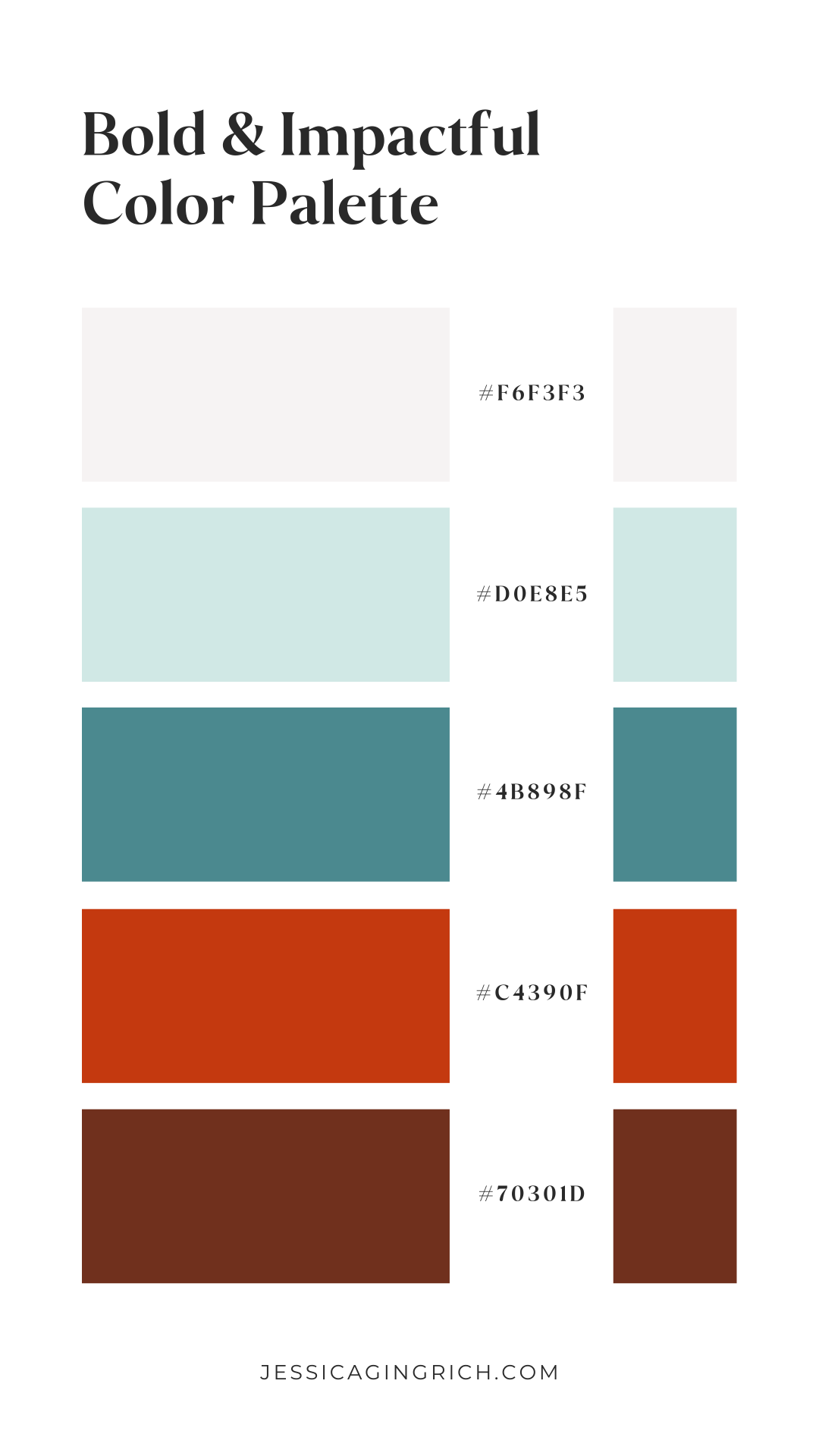
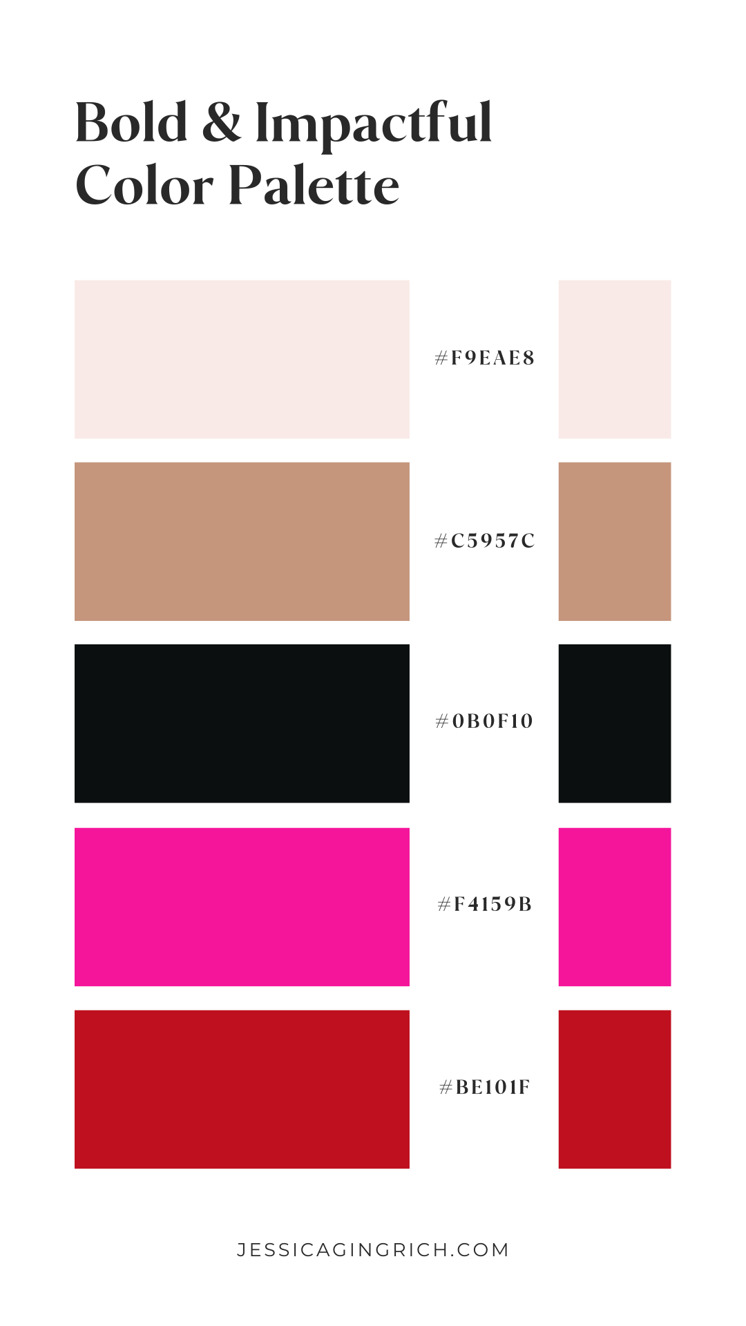
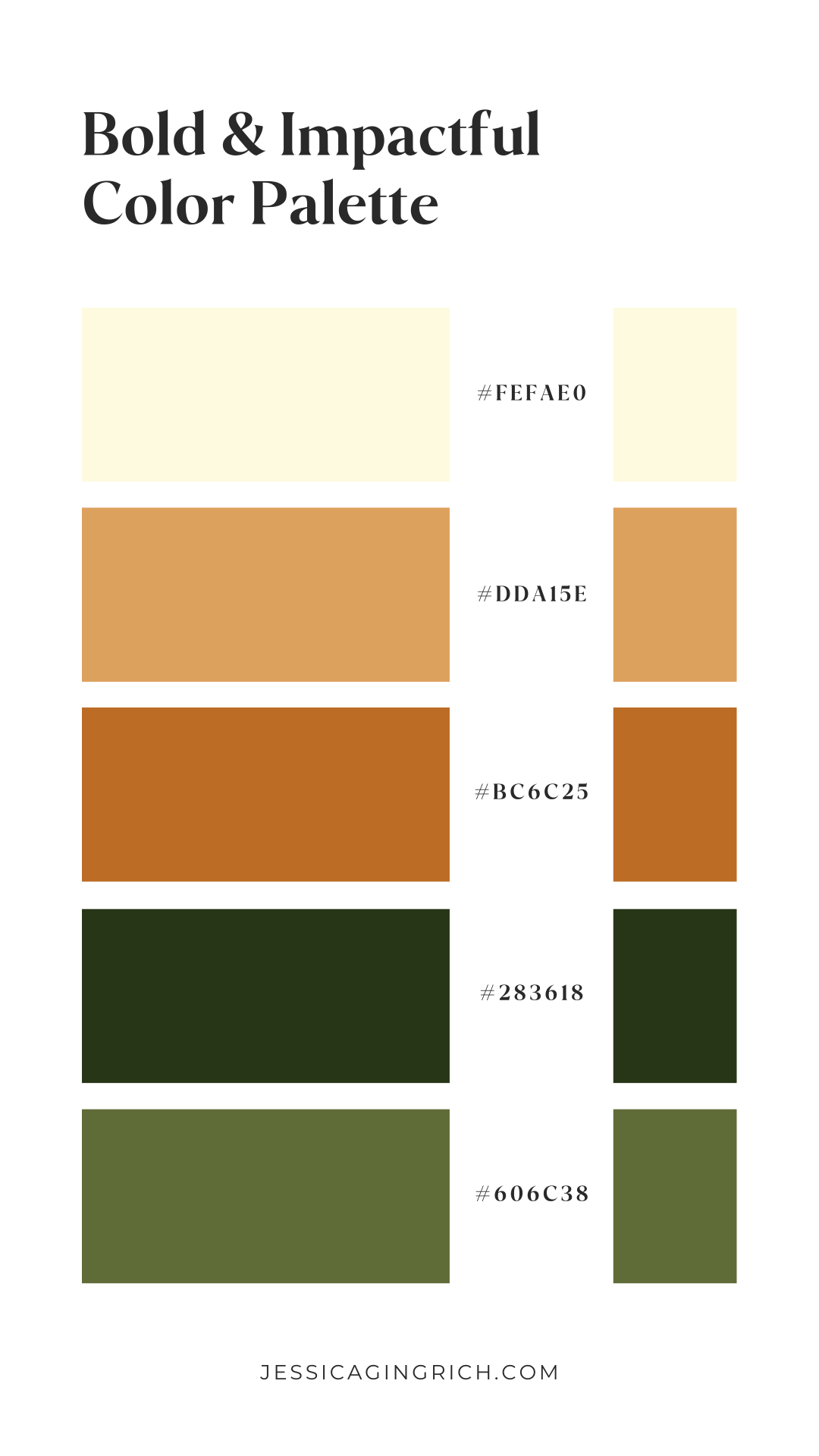
The go-getter (bold & impactful)
Are you bold, impactful, and ready to inspire your clients into action? You might fall within the go-getter personality.
Here’s some color palettes that would be great for you:
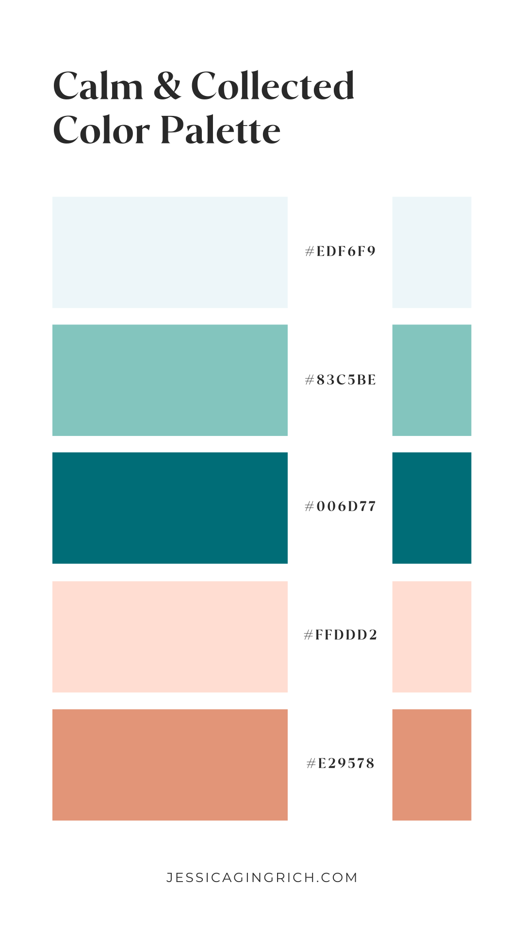
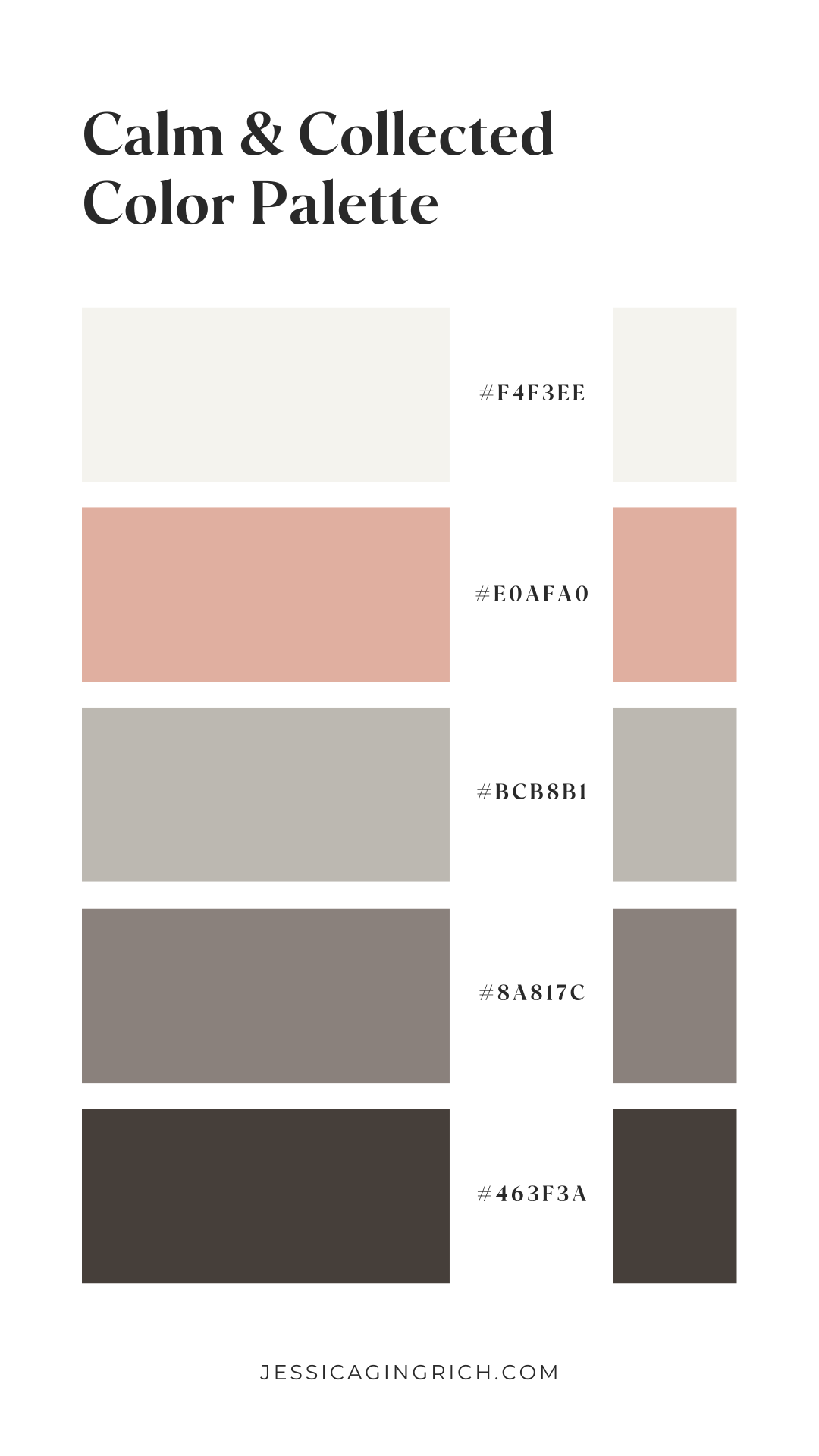
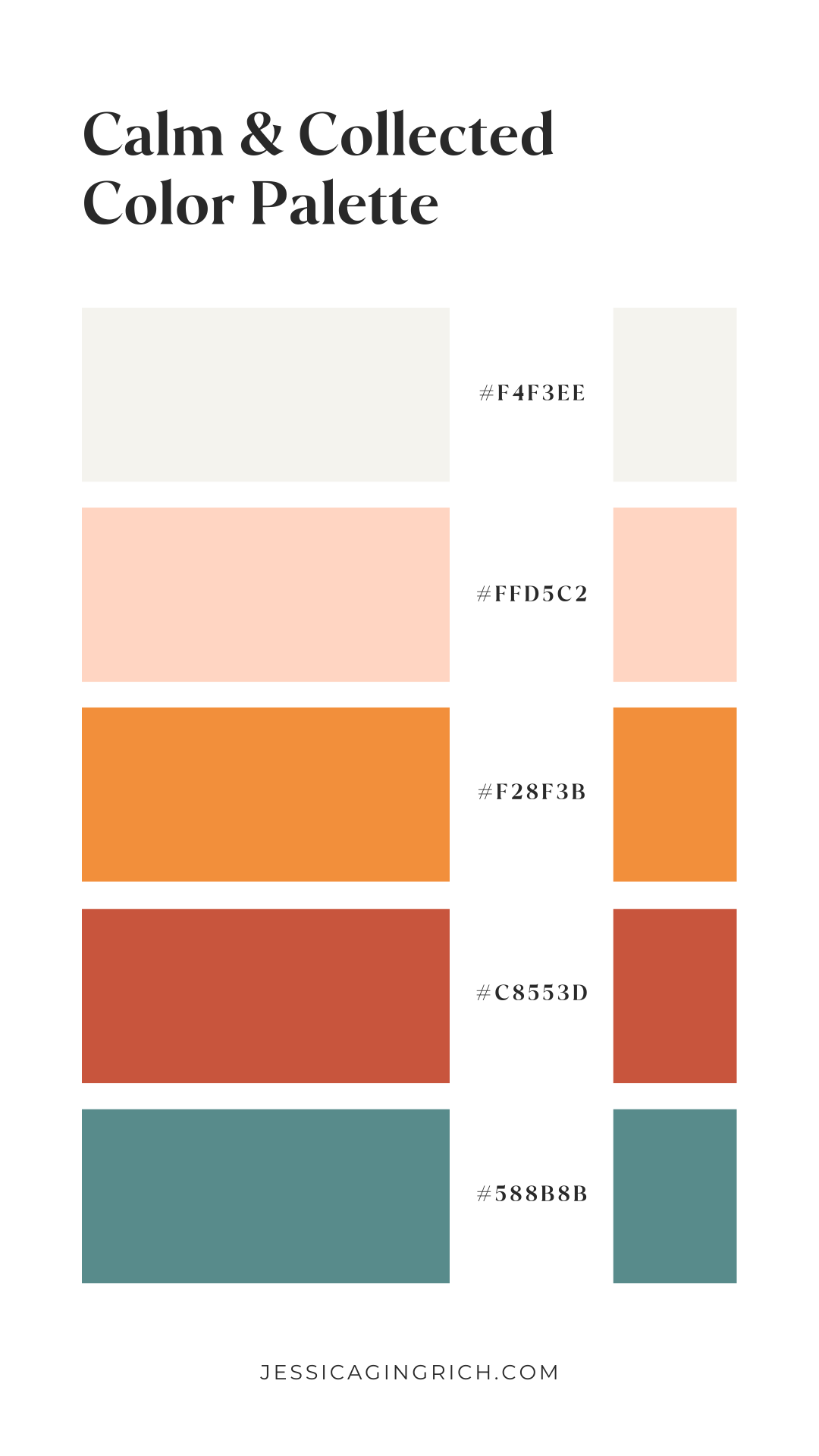
The trusted advisor (calm & collected)
If you’re the type of person people usually come to for advice and a shoulder to lean on, you may be a trusted advisor.
Look at these dreamy color combos to get inspired:
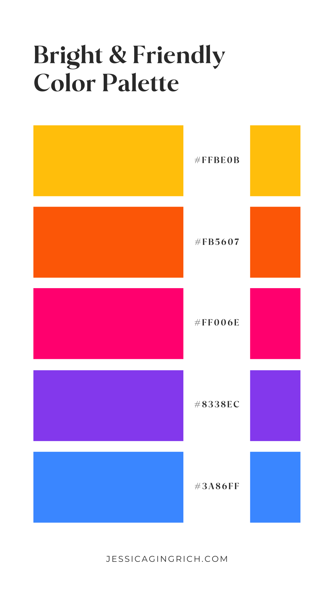
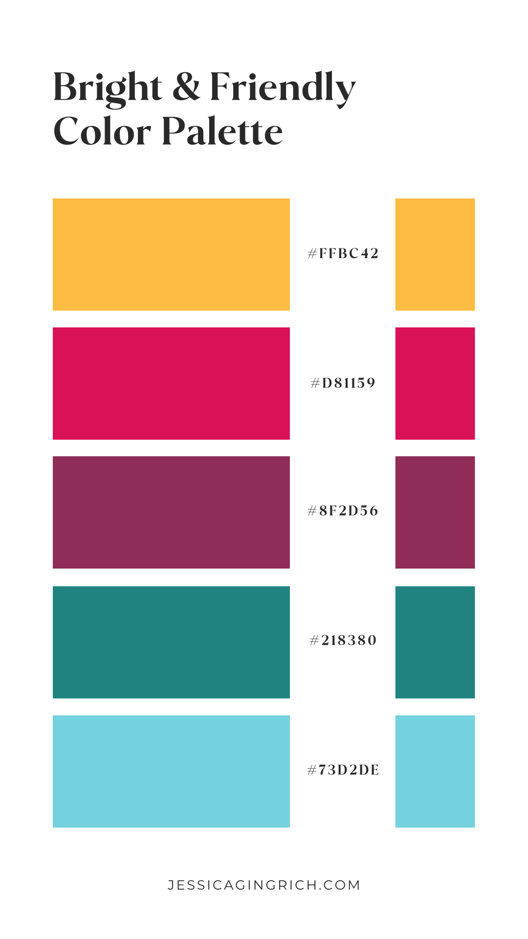
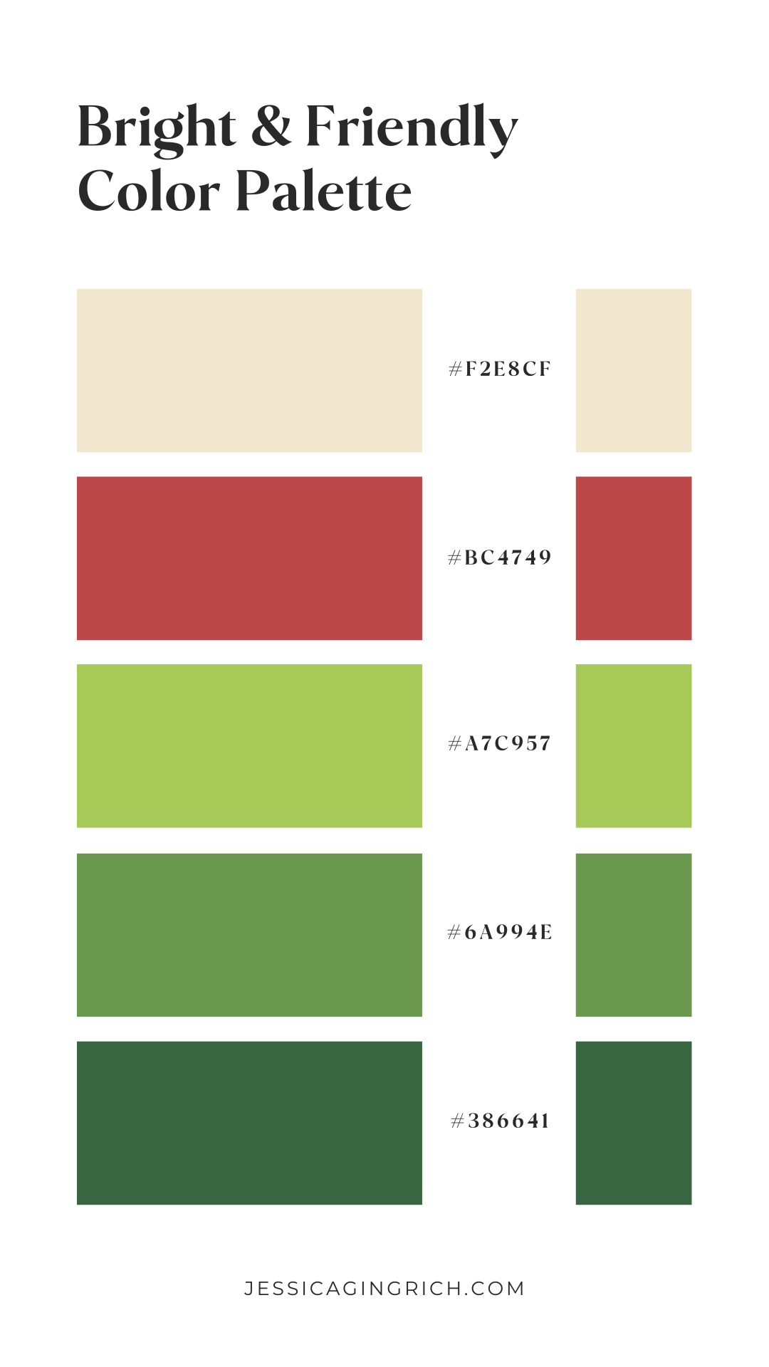
The BFF (bright & friendly)
Does everyone you meet feel like they’ve known you forever? Then, friend, you’re probably the BFF.
If that’s the case, these color palettes will win you over:
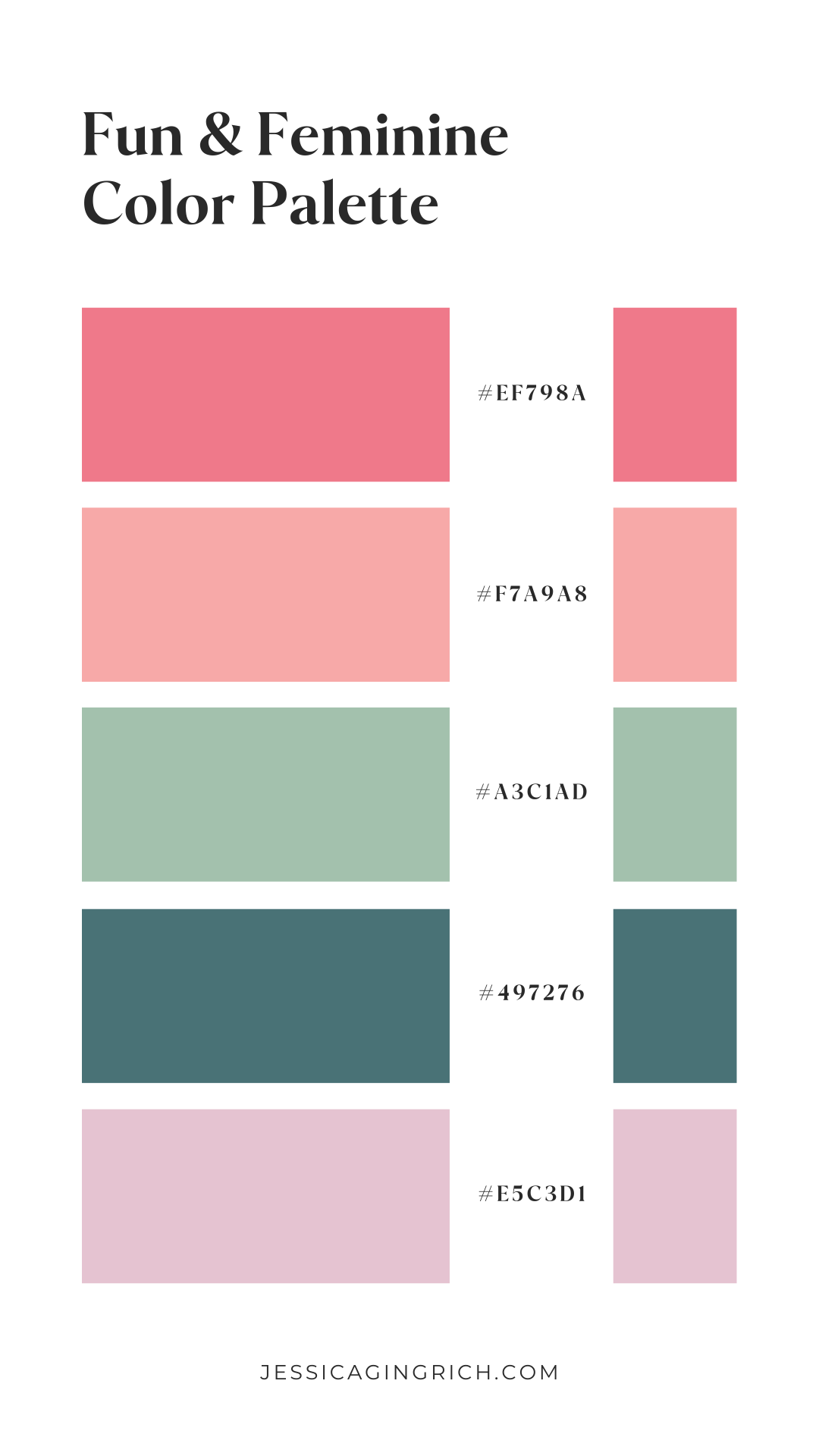
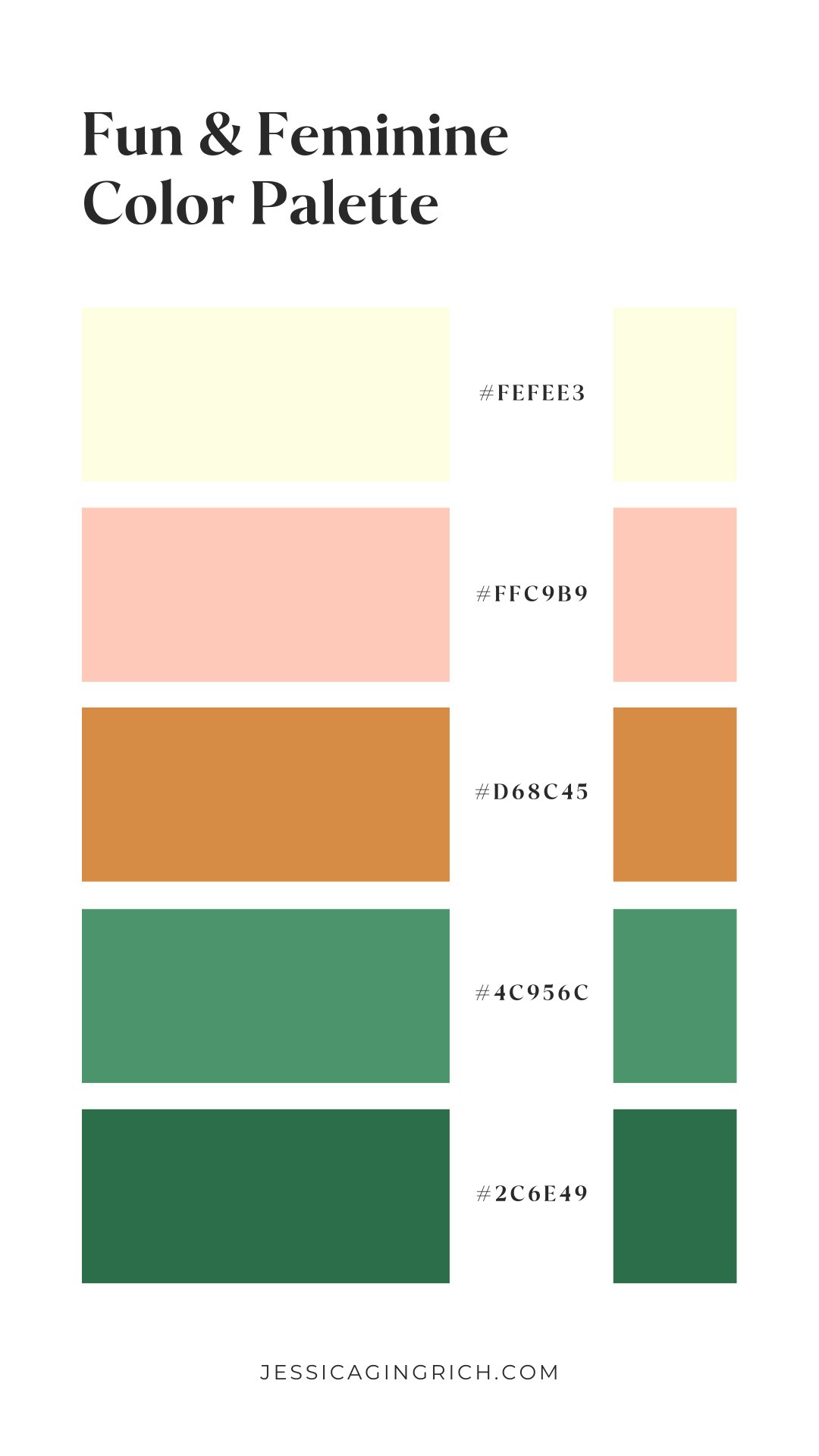
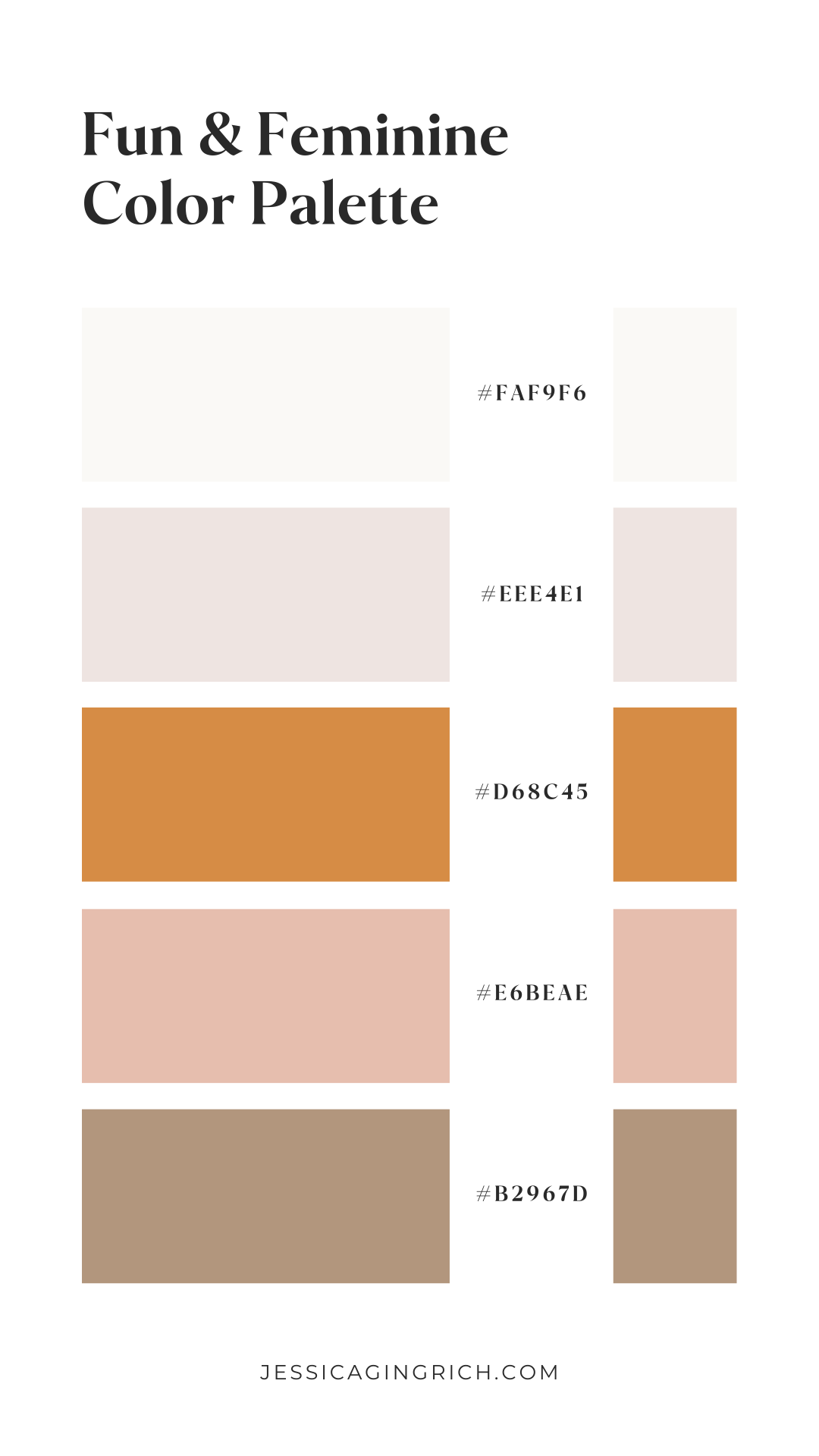
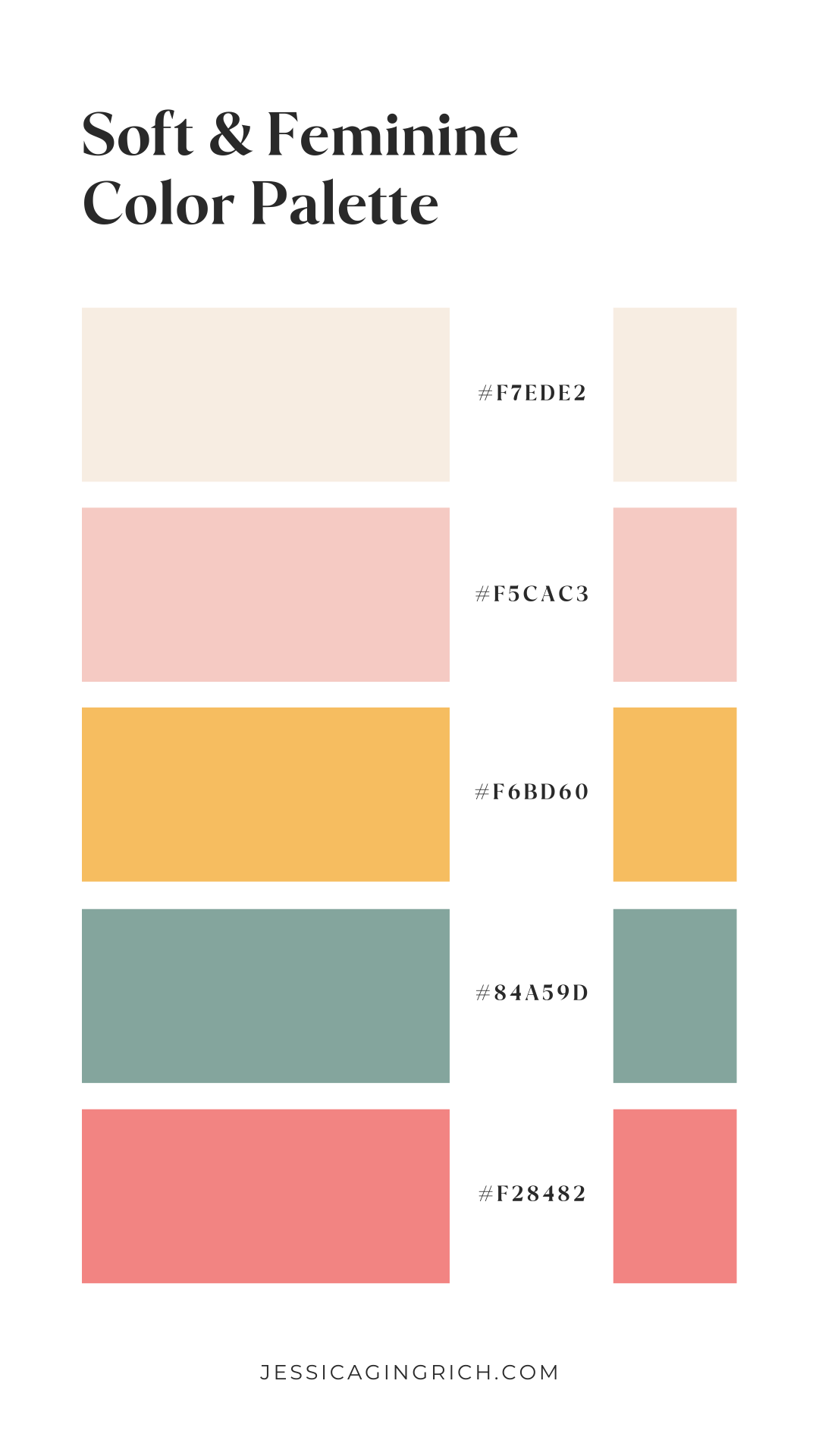
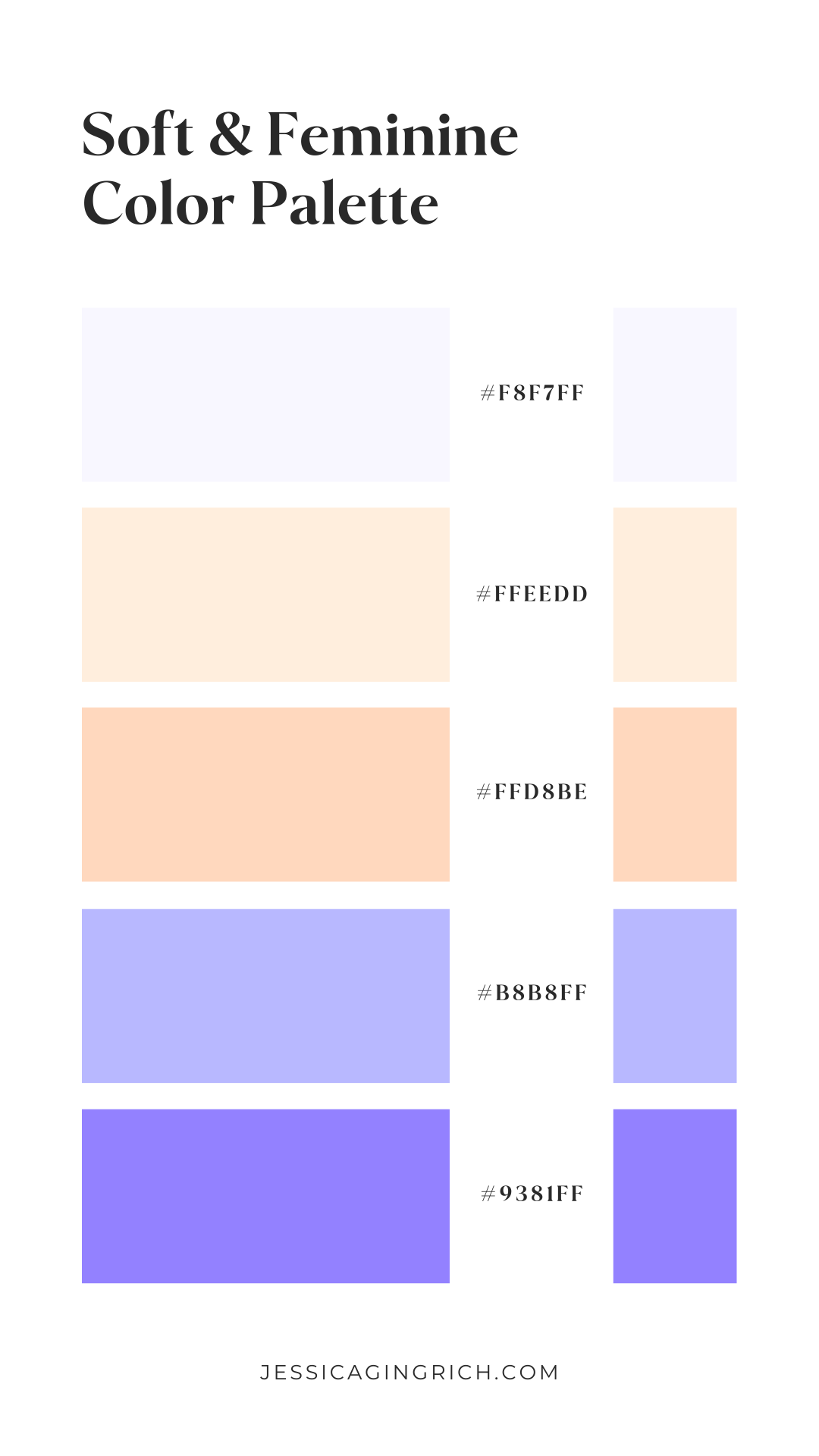
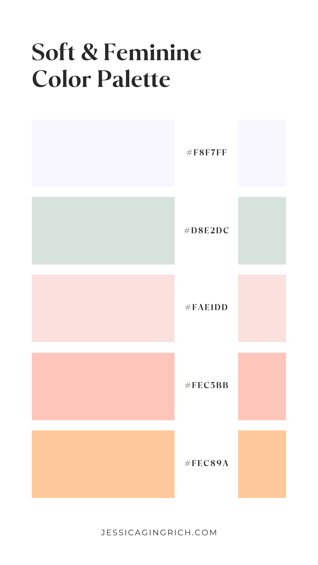
The cheerleader (fun, soft, feminine)
Are you the type of person that keeps people around you feeling inspired? Then you’ll fit right into the Cheerleader personality.
Now’s the time to inspire you, which is exactly what these palettes will do:
Ready to discover your brand personality?
Take this quiz to find out where your business falls and how you best connect with your dream customers!
Click here to take the quiz and get 15% off any of my templates.


