Deciding on a brand color palette for your business is a big decision. Color has such a strong emotional and psychological affect that you may not have considered! People usually mess up this part of their branding by doing one of three things when choosing their colors:
- They don’t commit to a color scheme, they just use whatever strikes them that day or week. Not having a consistent color palette is not only stressful for you when trying to create content but it can be confusing for your audience.
- They go with colors that are on trend but don’t actually coincide with the attitude their brand needs to portray.
- They use personal preference when selecting their colors, and don’t take into consideration their ideal client and brand archetype. You should hopefully like your colors, don’t get me wrong, but it shouldn’t be the main driving factor without having some reasoning behind it!
So let’s chat about what exactly you should consider when choosing the colors for your brand identity and you’ll use these colors throughout your collateral, social media and website design for a cohesive, on-brand feel!
Who is your ideal client and what colors appeal to them?
Think about who you are targeting with your product or service. Is there a color that they are drawn to? Is there a color that represents their niche? For example, I target female entrepreneurs that usually have more feminine, modern styles. This means that they may be attracted to pink hues which is obviously a feminine color that exhibits a nurturing vibe. Consider who your ideal client is and research what colors speak to them or that they are drawn to. This isn’t the only consideration though as you want to make sure they colors your select not only appeal to your ideal client, but also accurately represent your brand archetype. So let’s look at this as being just one piece of the pie.
What feelings are you hoping to evoke within your ideal client?
Are you wanting to create a sense of friendliness, knowledge, approachability, femininity, confidence, harmony, nurturing, growth? Consider what the purpose behind your brand is and what your brand archetype is so that you can better understand what colors would fit best in order to achieve the feeling you want to evoke! For example, my brand archetype is “Hero” and “Girl Next Door” which means that I want my visitors to know that I am there as a source of confidence, guidance, motivation but also am approachable, relatable and dependable!
Here’s a rundown of what each color means:
Blue: calming, credible, professional, tranquil, reliable, open
Red: passionate, dynamic, powerful, bold, motivated, assertive
Purple: luxury, visionary, regal, intrigue
White: bright, airy, minimal, modern
Black: strong, bold, dramatic, sophisticated, knowledgable
Teal: creative, calming, fresh, healing, growth
Orange: playful, optimistic, encouraging, energetic, social, friendly
Brown: wholesome, reliable, rustic, rooted, approachable, trustworthy
Gray: timeless, classic, efficient, solid, professional
Green: nature, growth, balance, freshness, prosperity, organic
Pink: delicate, feminine, calming, compassion, nurturing
Yellow: cheerful, happy, confident, innovative, vibrant
How to create a color palette that works together.
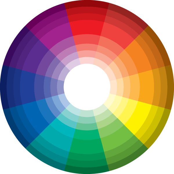
Now that you have an idea of a color or two that appeal to your ideal client and are aligned with your brand, let’s figure out how to pair colors with them. There are a few different types of color schemes you can use for your selection: monochromatic, complementary, analogous, triadic, and split complementary.
Here is the color wheel for your reference:

Monochromatic means you have one color and you are simply using different shades and tints of that color. For example – pink, light pink, dark pink.
Complementary means you have 2 colors that are opposite each other on the color wheel – such as green and red, blue and orange. You do not have to use the primary colors when going with a complementary color scheme, you can play with the hues to make them fit your brand!
Analogous would be using 3 colors that are adjacent to each other on the color wheel – like blue, teal and green! Or purple, red, pink.
Triadic is using colors that are evenly spaced around the color wheel so that the color form a triangle. Green, orange, purple.
Split complementary means you are using a primary color and then the to colors that are adjacent in the color to it’s complementary color. For example, red, teal and yellow green.
Hopefully that’s clear to understand that different schemes you could go with for your brand color! You can play with the color wheel here to get a better understanding if you are a visual person like me! 🙂
Now, there’s 3 ways you can go about finding inspiration for the actual colors you will use for your branding.
- Check out this random color palette generator called Colormind if you want to come up with your own custom one. You can generate a variety of palettes and lock colors as you come across them that you feel fit!
- Head to Pinterest and search “color palettes”. There are TONS of beautiful color palettes that others have already created and you’ll probably be able to find something you love with your chosen colors!
- Find an image on google or Pinterest that you feel has the color scheme and vibe that represents your brand and upload that image on another colormind app. This will generate color palettes that are found in the image that go well together.
I usually recommend having a couple neutrals paired with your accent color/colors for your brand color palette. So maybe a dark gray and an off-white. Or a dark blue and a pale cream. Then using a combination of 1-3 colors in between. For these colors you can build off the different color schemes I mentioned earlier – monochromatic, complementary, analogous, triadic, and split complementary. Once you have colors that you love, plug them into your branding material or your website and see what you think and if everything feels right! Want an outside opinion? Feel free to shoot me an email with what you are working with and I’ll give you my thoughts!! 🙂
Want to get a headstart on your own business brand identity? Grab on of my free brand kits here!
Colors are such a fun piece of your branding, and so stinkin’ important so just make sure to spend the time getting to know your brand’s purpose and what colors best portray that!
