A good font can be one of the biggest identifiers for a brand. Just think of Disney’s or Coca-Cola’s if you’re unsure.
On your website, your font is also crucial for transmitting your message. A bad font choice can negatively impact your SEO, scare people away, and affect your sales. On this blog, we’re diving into everything you’ll need to know on selecting fonts for your brand. These tips are mostly for your website, but they’ll also help you settle into a style and work on things like social media graphics. Let’s dive in!
Why selecting fonts that pair well together matters for your brand
1 – SEO and accessibility
Search engine optimization, or SEO, means making your website attractive for Google to rank. This includes things like keywords and title tags, which we won’t go into. But it also includes factors like accessibility. Accessibility is basically making sure that anyone can read your content, including tools like TTS (text to speech) and similar software. To improve your website’s accessibility, you need to prioritize fonts that are easy to read.
Besides this technical aspect, a good font pairing is kind to your reader: It makes your website a more pleasant experience.
2 – Brand identity
Your brand is a combination of what you’re trying to communicate with what people feel when they interact with your business. The font you choose can play a big part in giving off the right vibes – classy, youthful, luxurious, and more.
Your choice of font can make a lasting impression on your audience. As I mentioned earlier, a signature font can make you stand out. If someone is scrolling through their feed and spot a graphic with a font they recognize, they’re more likely to stop and read or engage with the post.
The basic font types you need to know before you start pairing
There are four basic font families you’ll find. These are:
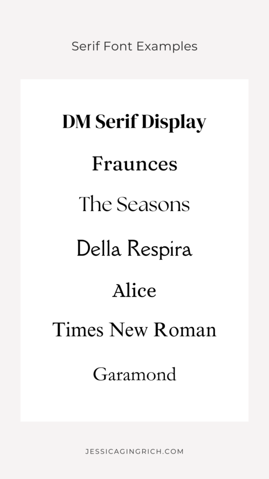
Serif
This type of font is called that because they have “serifs,” which are the little things at the end of each stroke.
Serif fonts are classic and often used for brands like newspapers or banks. They feel solid and trustworthy. Some good examples of brands with serif fonts include J.P. Morgan and Tiffany & Co.

The most common uses for Serif fonts are titles or accents, but not as much for web content anymore. They can feel a bit dated if used in excess. A good font pairing can include serif and sans serif fonts for a more modern look.
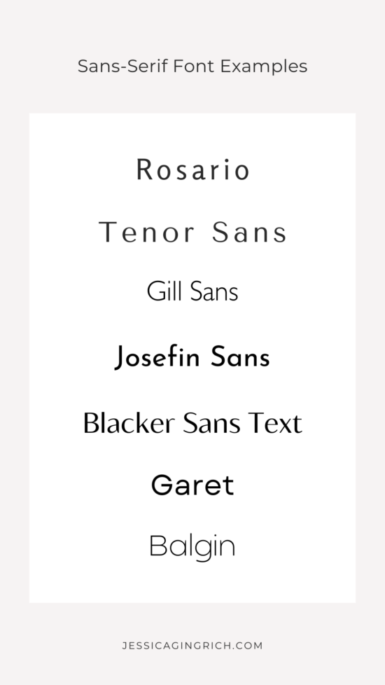
Sans serif
Sans serif fonts feel modern and clean. They’re more minimal in design and, as the name implies, they have no “serifs.” A lot of internet brands use sans serif fonts, like Google and Netflix, for example.

Sans serif fonts are the most used now for paragraph text in websites, blogs, and content in general because they’re easy to read. A good sans serif can make a great font pairing with virtually any other style.
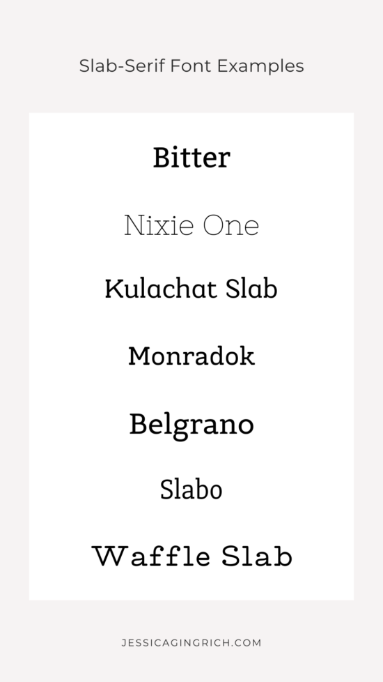
Slab serif
Slab serif is a more exaggerated version of serif, with heavier finishes than traditional serif. In the case of slab serif, the entire letter has the same weight, whereas the “serifs” in a serif font are thinner.

Slab serif fonts are bold and can be found in logos, titles, book covers, and more. Sony’s font is considered slab serif.
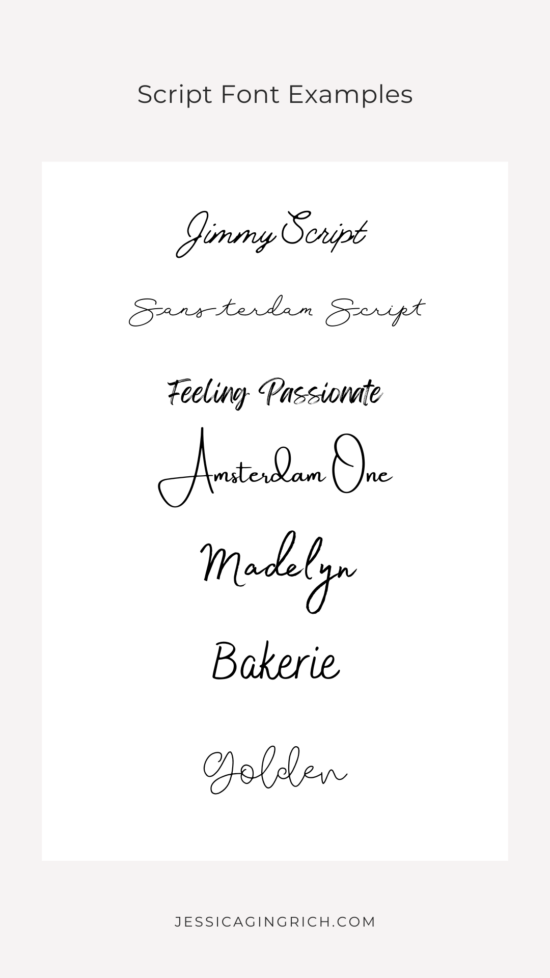
Script
Finally, script fonts are meant to look like handwriting. These are more feminine and usually feel elegant and sophisticated.

This type of font is great for logos, titles, and other accents, but I’d recommend staying away from it for big bodies of text. You also want to ensure that your script font is easy to read when using it in logos or titles, as this style is so ornate it may be challenging at times. Pairing your script font with a minimalist font, usually a sans serif, is a safe way to add some glamour without going over the top.
Famous brands using script fonts include Cadillac and Johnson & Johnson.
Selecting Fonts for your brand and website
Experiment different placements
If you’re in love with a font that doesn’t quite work on your homepage, save it for later. Maybe you’ll find that it works perfectly for social media or your freebie in the future.
Don’t be afraid to mix and match
It’s okay to choose a font for your logo and use a different font style on your website or social media graphics. They should still look good together, though. You don’t want to pick clashing styles since they’re all part of your brand identity.
You’ll need 2-3 font options
Your website will have at least a title or heading, subheadings, and body text. You can have some fun with a decorative font for your headings or accent text (like a testimonial) and keep things simple for bigger pieces of content like your service descriptions.
Some of the most common pairings include a script font with a sans serif. Or serif and sans serif. But you’ll rarely find two of the same type of font together.
Where to find font pairings
Pinterest is a good place to find examples of a good font pairing. You can also play around in a Google doc to get a sense of what you like before shopping. Next, the best option for choosing a font directly from the designer would be Creative Market. This way, you can buy the license directly and save yourself a lot of headaches if you decide to trademark your logo and stuff like that.
You can learn more about font licenses here.
Other places to check include Adobe Fonts. However, Adobe Fonts is mostly used by designers as it comes with the Adobe subscription — ie, you won’t be able to buy a single one. But depending on your business, it may make sense to have.
Other lowkey alternatives include Font Squirrel and 1001fonts. That said, I’d strongly recommend you review their licenses and policies to prevent legal issues. Similar to Google Fonts, these fonts are free, and some of them may have open licenses, but you won’t have exclusive rights.
Your font selections are a reflection of your brand personality
Every touchpoint between you and your audience adds an extra layer of information about who you are as a business owner and why they need to do business with you.
The first step to getting your branding just right is to discover your brand personality. Take the brand personality quiz to discover your brand’s DNA and get inspired! Plus, get 15% off in every template when you complete the quiz.