


There’s a difference between a Showit site that looks like it was built from a template and one that looks like it was designed. The gap between the two usually isn’t about budget or time — it’s about a handful of decisions that most people don’t know to make.
After 8 years as a Showit Design Partner and over a hundred sites built on the platform, I’ve developed a pretty clear sense of what separates a site that looks polished from one that just looks fine. These are the Showit design tips I come back to on every project.
1. Limit yourself to three fonts maximum
The most common design mistake I see on DIY Showit sites is too many fonts. It’s easy to get excited about Showit’s font library and end up with four or five different typefaces that each feel right in isolation but create visual chaos together.
Three is the right number, and here’s how to use them: one display font for your largest headings (often a script or serif), one clean font for subheadings and smaller headings, and one highly readable font for body text. That’s it. Apply them consistently across every page and your site will feel immediately more cohesive.
If you’re not sure which fonts to pair, look at your favorite brands or editorial sites and note the combinations they use. Most refined designs use far less variety than you’d expect.
2. Use white space like a design element, not an accident
White space — the empty areas around and between your design elements — is one of the most powerful tools in web design, and one of the most underused. When everything is packed tightly together, nothing stands out. When you give elements room to breathe, the whole page feels more intentional and premium.
In Showit, you have complete control over spacing. Use it deliberately. Increase the padding around your sections. Give your headings more breathing room above and below. Let your images sit with space around them rather than touching the edges of the canvas.
A simple test: if your homepage feels busy or overwhelming, try doubling your section padding before you change anything else. You’ll often find that’s all it needed.
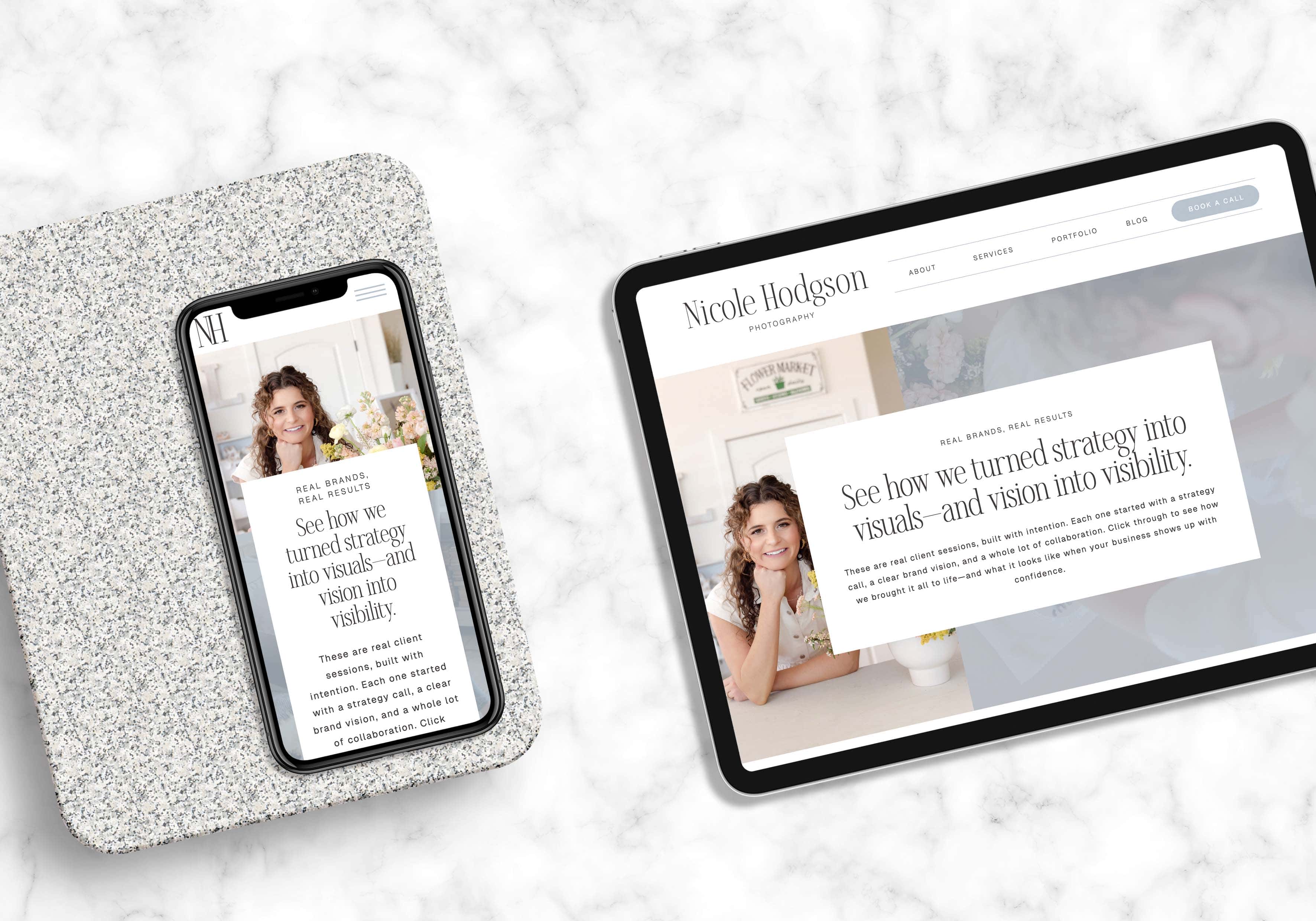
3. Create a consistent color system and stick to it
Before you start designing, define your color palette clearly — and then use it consistently across every page, every section, every element. This sounds obvious but it’s remarkably easy to drift, especially as you build out more pages over time.
A workable palette for most service-based websites has four colors: a primary background color (usually light — cream, white, warm gray), a secondary background for contrast sections (slightly darker or warmer), a text color (near-black, not pure black), and one accent color for buttons, links, and highlights.
In Showit, you can set your colors globally which makes applying them consistently much faster. Take the time to do this upfront and you’ll save yourself a lot of cleanup later.
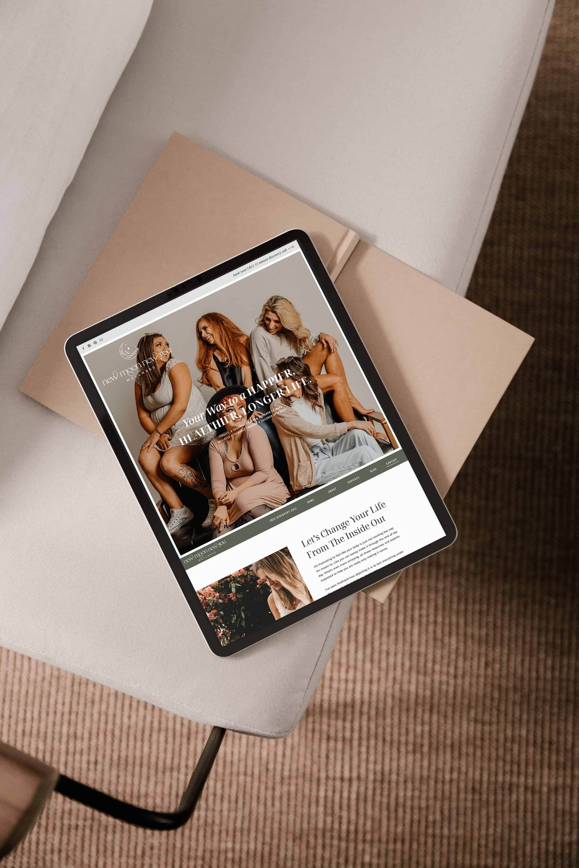
4. Be intentional about image consistency
Nothing makes a DIY site look more homemade than inconsistent photography. When images vary widely in tone, color temperature, lighting style, or subject matter, the site feels patchy even if the layout and typography are strong.
You don’t need a professional photoshoot to fix this — you need consistency. If you’re using stock photos, choose a collection from the same photographer or series. If you’re using your own photos, select ones taken in similar lighting conditions. Warm, natural light tends to work well across most brand aesthetics.
Also pay attention to the direction people are facing in your images. A person looking left on the left side of the screen, or looking away from your call-to-action, subtly pulls the reader’s eye in the wrong direction. Small adjustments like this add up.
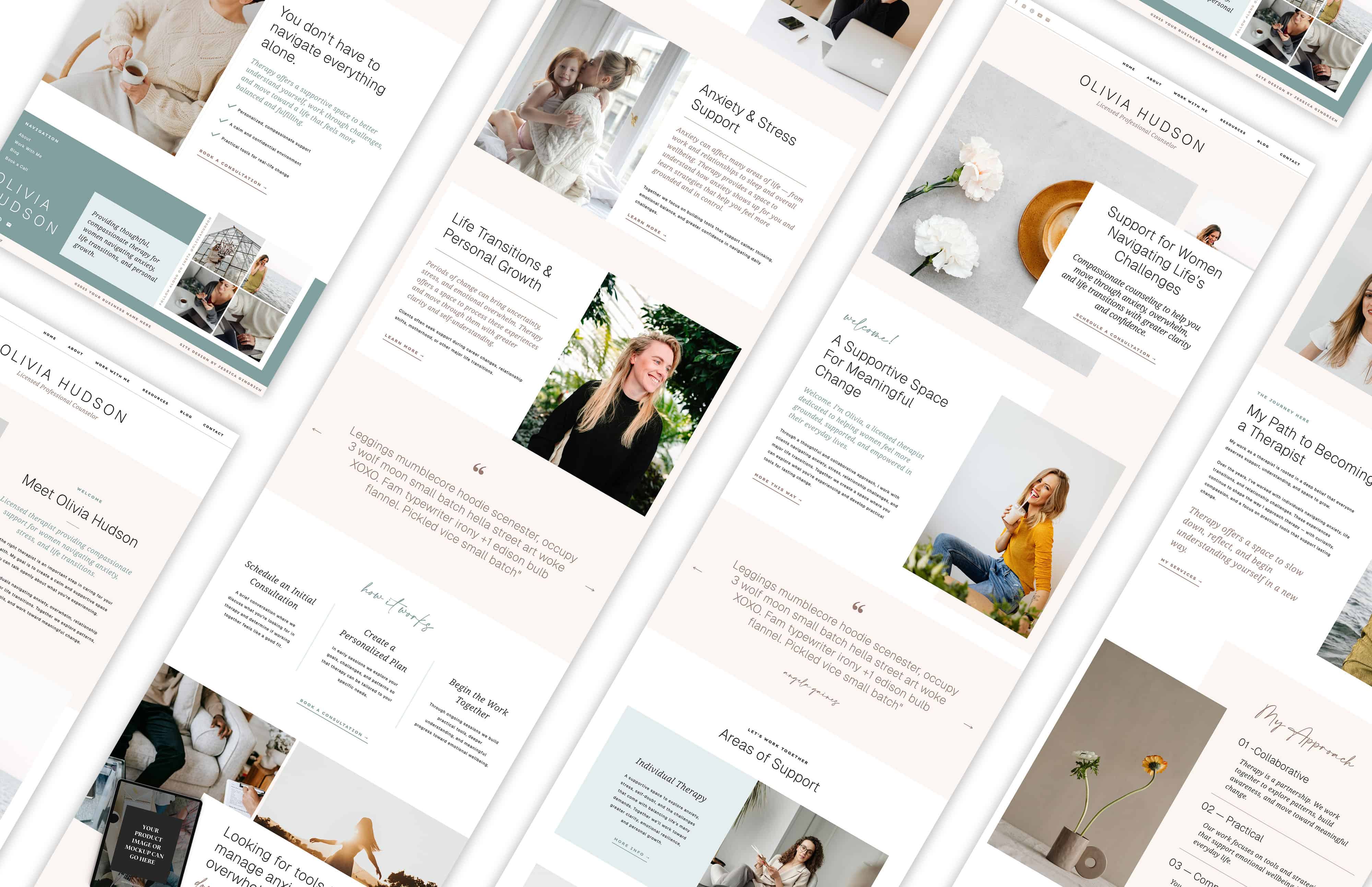
5. Design your mobile layout with fresh eyes
Most Showit users treat mobile design as an afterthought — something to tidy up after the desktop version is done. This is worth reconsidering, especially since more than half of your visitors are likely arriving on their phones.
In Showit, your mobile layout is separate from desktop, which is a genuine advantage. But it means you need to actually design it, not just adjust it. Go through every page in mobile view as if you’re seeing it for the first time. Ask: is the hierarchy clear? Is the text readable without zooming? Are the buttons easy to tap? Is anything overlapping or getting cut off?
The most common mobile issues I fix on client sites: font sizes that are too small, sections that are too tall on mobile, and CTAs that are buried below content that should have been shortened or removed for the smaller screen.
6. Use section backgrounds to create visual rhythm
A page that uses the same background color throughout from top to bottom reads as flat and monotonous. Alternating your section backgrounds — light, slightly darker, light again — creates a natural rhythm that keeps the reader moving down the page without feeling like everything is blending together.
In Showit, this is straightforward to implement. Even subtle variation (cream to warm white to light beige) makes a difference. You don’t need dramatic contrast — just enough differentiation to signal that a new section has begun.
7. Align everything to a grid
Showit gives you a lot of freedom, which is part of its appeal. But that freedom can work against you if elements are placed without reference to a consistent grid. Random alignment — where text starts at slightly different left margins, or images are nudged to various positions — creates a subtle visual disorder that makes a site feel less professional even when you can’t immediately identify why.
Use Showit’s alignment tools to anchor your elements to consistent positions. Your text should start at the same left margin across sections. Your columns should align. Your images should sit at deliberate positions relative to the canvas edges. Discipline with alignment is one of the things that most distinguishes a designer’s eye from a DIY approach.
8. Keep your navigation simple and your CTAs clear
This is less a visual design tip and more a strategic one, but it has a direct impact on how your site looks and performs. Navigation menus with six or seven items feel cluttered and force the visitor to make too many decisions at once. CTAs buried at the bottom of long pages, or written in passive language like “learn more,” don’t convert.
Five navigation items or fewer. CTAs that are specific and action-oriented (“book a consult,” “browse templates,” “get started”). And at least one CTA visible without scrolling on your homepage. These aren’t design flourishes — they’re the functional decisions that determine whether your site actually works.
9. Test your site on a real phone before you publish
This sounds so simple that it barely feels worth saying — but a surprising number of Showit sites go live without the owner ever actually viewing them on a phone. The mobile preview in the editor is useful, but it’s not the same as holding your site in your hand and scrolling through it the way a real visitor would.
Before you publish, pull up your site on your own phone and click through every page. You’ll catch things you never would have seen in the editor: text that’s uncomfortably small, images that are cropped in unexpected ways, buttons that are hard to tap, sections that load slowly. Fix those things before anyone else sees them.
10. When in doubt, take something away
The instinct when building a website is to add — more content, more sections, more information, more visual elements. The instinct you want to develop is the opposite. Every element on a page should earn its place. If something isn’t actively helping the visitor understand who you are or what to do next, it’s probably adding noise.
The most effective Showit sites I’ve built are almost always the ones with the most restraint. Clean layouts, purposeful imagery, clear copy, one CTA per section. When you strip away everything that isn’t necessary, what remains lands harder.
Ready to put these into practice?
If you’re starting with a template, the structural decisions are already made for you — which means you can focus your energy on the customization details that make a site feel like yours. Every template in the shop is built with these principles in mind: consistent spacing, clear hierarchy, intentional layouts designed to convert.


