Let’s talk about colors. I’m sure you know that different colors evoke different emotions and give off different vibes. This is why it’s so important to consider them when building your brand.
Color psychology is the study of hues as a determinant of human behavior.
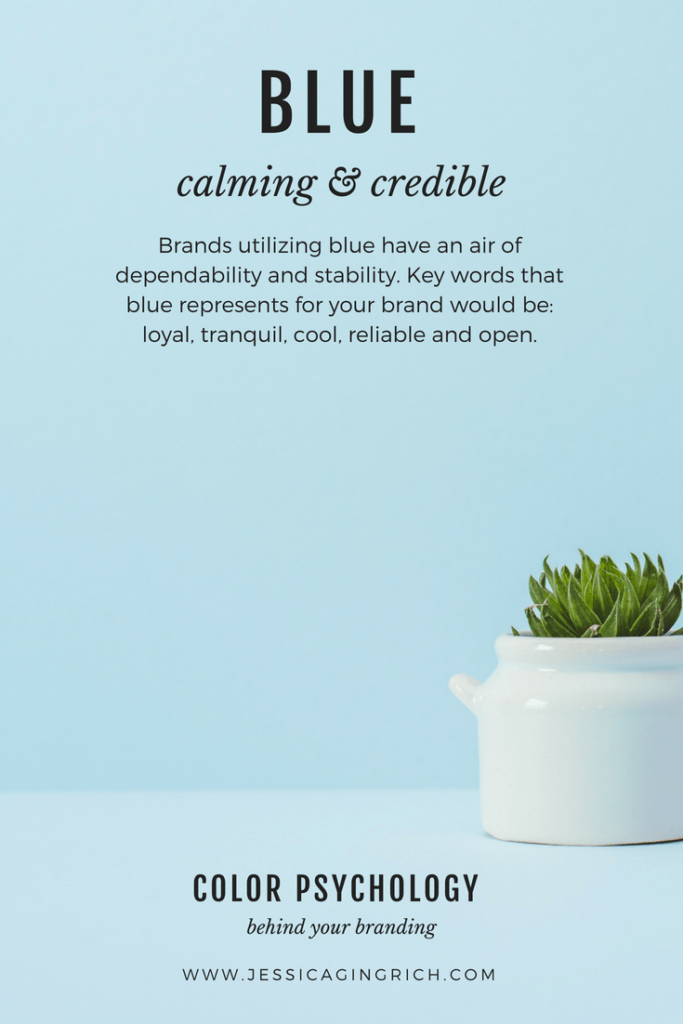
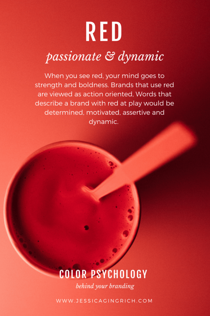
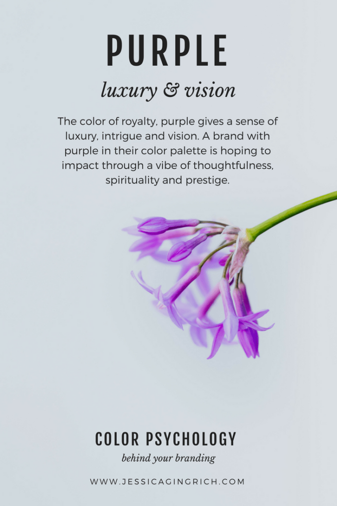
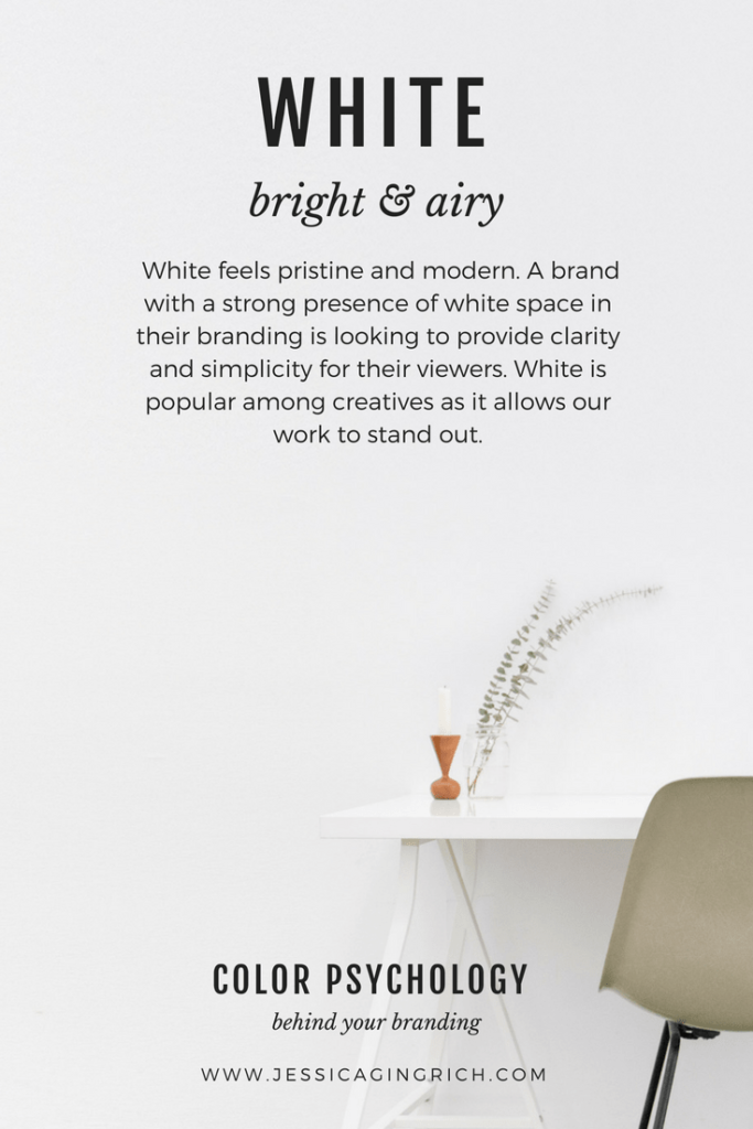
In branding we implement this study when trying to appeal to our target audience or market. You want your colors to speak to your ideal client and truly represent who your brand is. Are your colors attracting or repelling the client you’d love to serve? Let’s walk through the colors and the characteristics they are portraying so that you have a better idea of what direction your branding should go! Personal preference should not drive your color palette, appealing to your client is of much more importance is you want to be successful! This concept goes with logo design and all branding design. While it’s awesome if we love our branding and such, it’s most important that it sends the right message to those we selling to and serving.
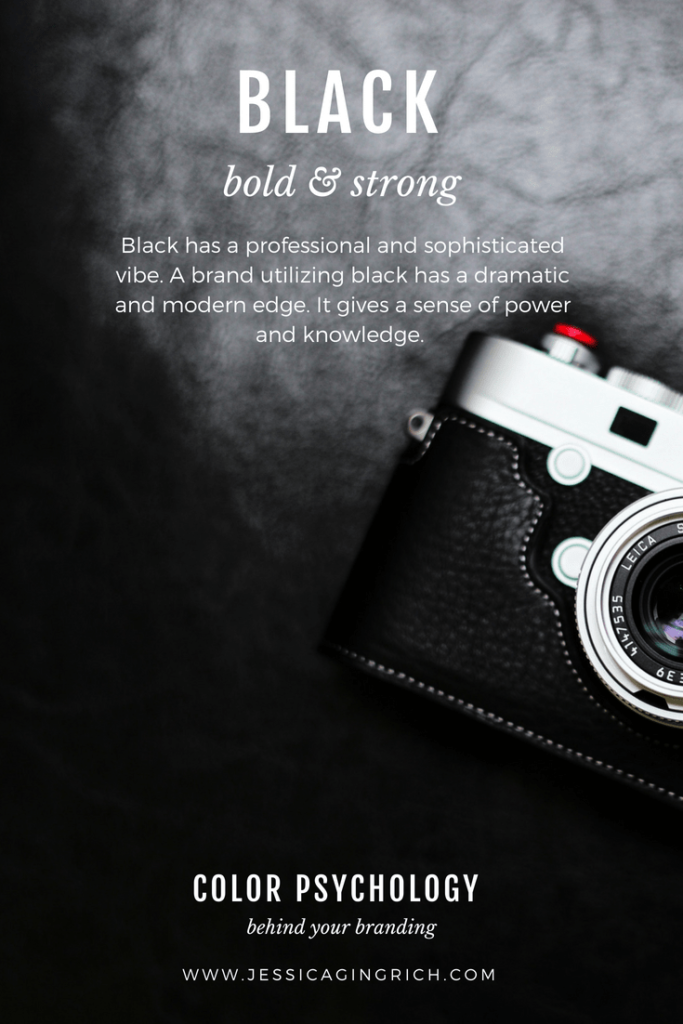
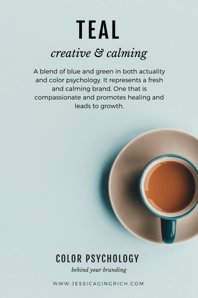
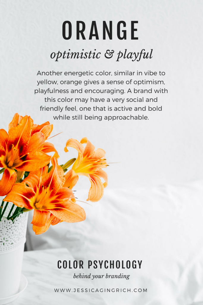
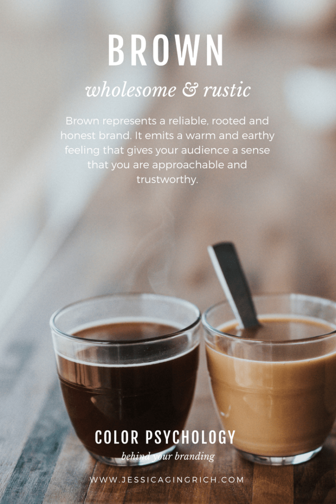
In my own branding I pair gray and black with the more feminine pink in order to create a vibe that is feminine but classic and strong. This helps me appeal to my target market of strong female creatives and entrepreneurs.
Ready to work on your own brand?
Get access to our free brand library and get started building your brand identity now!