Before choosing a Showit template to feature your services, go through these 3 steps to make the decision process easier.
“I strive for two things in design: simplicity and clarity. Great design is born of those two things.” – Lindo Leade
Choosing a Showit template goes beyond finding a website that looks good. The features, layout, and functionality of the template should complement what you’re looking to convey with your website.
Here are 3 things to do before choosing a Showit template.
1. Know who you serve so your Showit template appeals to them
You’ve probably visited over a dozen websites today alone. Some of the websites will make you wince because of the popups, abrasive colors, or hard to read fonts. Then there are some websites that are so easy to navigate you didn’t realize that you’ve spent the last 5 minutes clicking around.
The first step to choosing a Showit template that gives your audience a pleasant experience is knowing who that audience is.
You don’t have to get crazy specific about who your audience is.
“Moms who want to earn extra income working from home,” offers more flexibility than “Middle-class moms with small children living in Georgia.”
Your idea of who your audience is doesn’t have to be perfect, but it has to give you a starting point to choose the right Showit template.
If you’re struggling to narrow down on your audience, remember that your specific audience may be bigger or smaller than someone else’s. Take a look at the clients you’ve served in the past 6 months, particularly the ones that you loved working with. If you haven’t signed your first clients yet, go through your social media and newsletters to find some business owners you’d love to work with.
What do all of these people have in common? It could be as specific as the industry or as broad as “they struggled with ________.”
Don’t skip this step. Every time you browse through the Showit templates, ask yourself, “Will the audience I serve love this?”
Ultimately, your website isn’t about you or what you do. Your website is about your clients and how they will benefit after working with you.
2. Create a message out of what you offer
Most service-based business owners struggle to define what they do and how to choose the verbiage that can best convey their talents. Standing out can seem daunting.
For example, you can’t just be a coach or a virtual assistant anymore because every day, more people trying to break into that same specialization.
Instead, you have to deliver a message defining what you offer.
Don’t try to fit everything inside the message. You should be able to tell someone what the primary result of your work is and leave the rest.
If you’re worried about missing out on work, you won’t. People will be drawn in by your initial message. After they get to know you or start working with you, they will naturally ask you about what else you do.
An easy formula that Storybrand teaches is to use this framework:
- What is the problem your audience faces?
- How does your business address this problem?
- How does your audience feel after you’ve resolved this problem?
Try it!
A fitness coach might say:
It’s hard juggling kids, work, and a healthy lifestyle. Use my pre-made meal plans and 10-minute exercise videos to save time and tone up in just a few weeks. With all you do for everyone else, isn’t it time someone took care of you?
This message will be reflected on every website page. As you’re scrolling through the Showit templates, imagine where you can plug your message throughout the site.
3. Gather your brand elements
Your brand elements include:
- Your fonts (including headers, quotes, body text, links, etc.)
- Your colors
- Your logo, favicon, and other design elements (including dividers, icons, your signature, etc.)
- Photos that you want to include in your website (if you don’t have headshots or your own photos to use, check out this post for great stock photography)
- Testimonials (including headshots or logos)
Ideally, you should also have content ready for your website, which includes:
- Your services (what you offer/do/sell)
- A small snippet about you and your experience
The worst thing that can happen is you choose a Showit template that you love, with the filler text and stock photos, but when you start customizing it, your website doesn’t look like that you imagined.
Think about how you’ll swap out the photos with your own. Imagine where your testimonials will go. Consider whether you’d still like this template after you’ve plugged in your own fonts, colors, and content.
Plus, if you have all of your brand elements in one place, all you need to do is enter it inside your new Showit template and you’ll have a brand new, beautiful website, in a day!
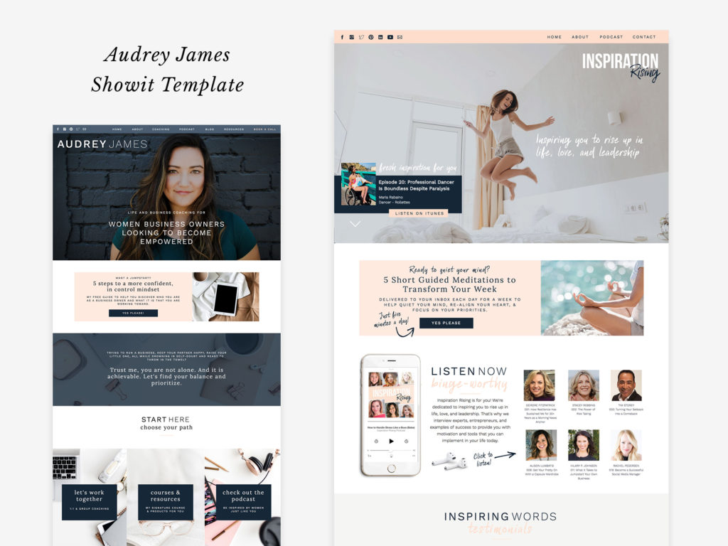
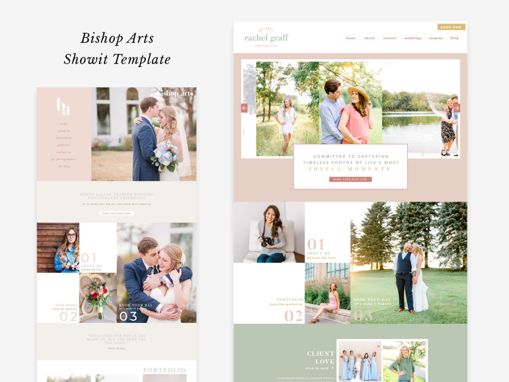
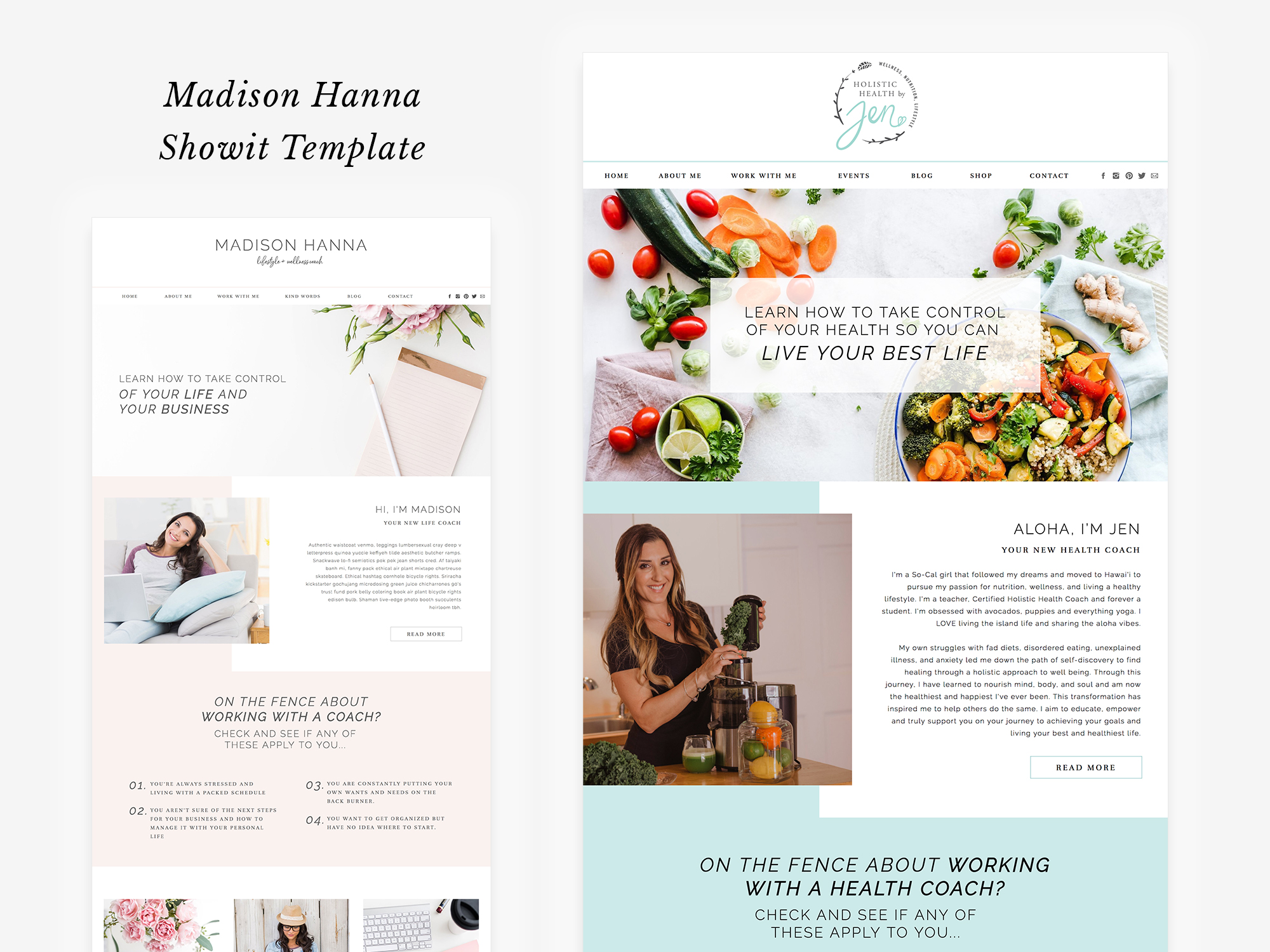
Here’s some more examples of how people have customized Showit templates for their own brand:
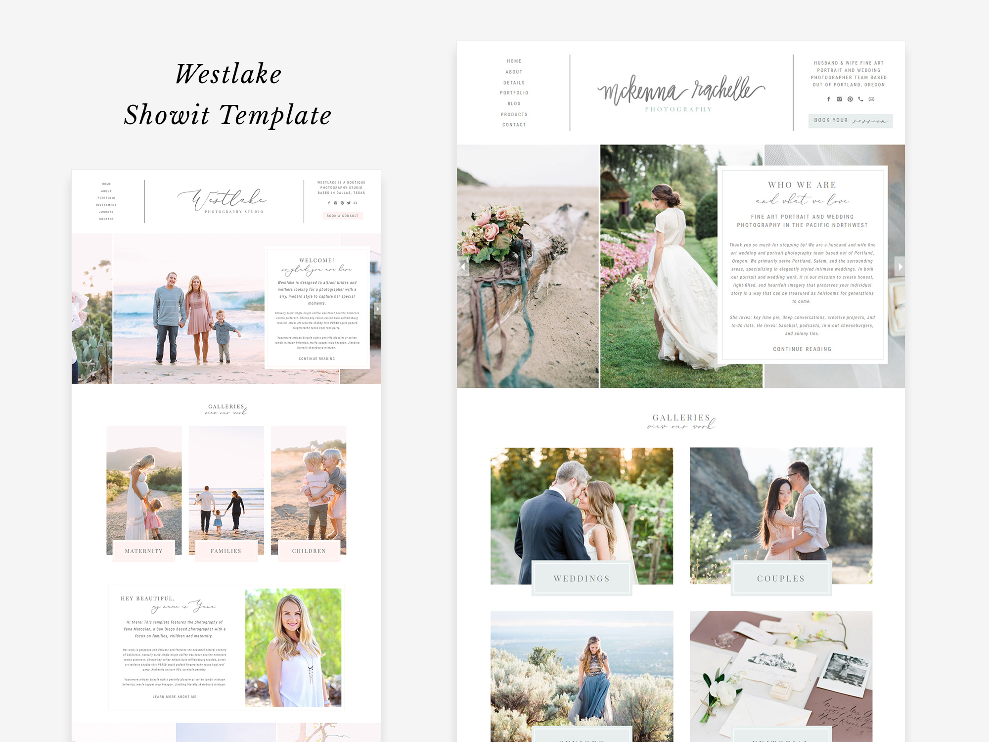
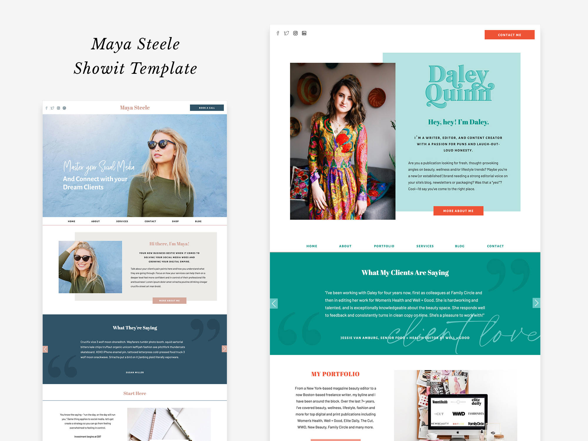
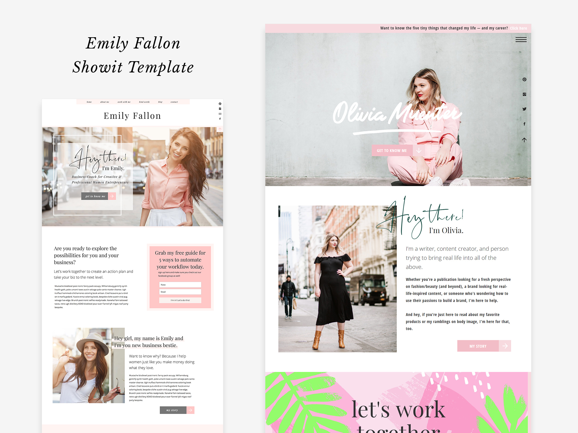
When you’ve completed these three steps and you’re ready to choose your Showit template, click here. If you’re stuck on which design to choose, send me an email at jg@jessicagingrich.com and let’s chat!
In the meantime, check out how easy it is customize a template in Showit and you’ll understand why this platform is the BEST website builder for service based entrepreneurs.
