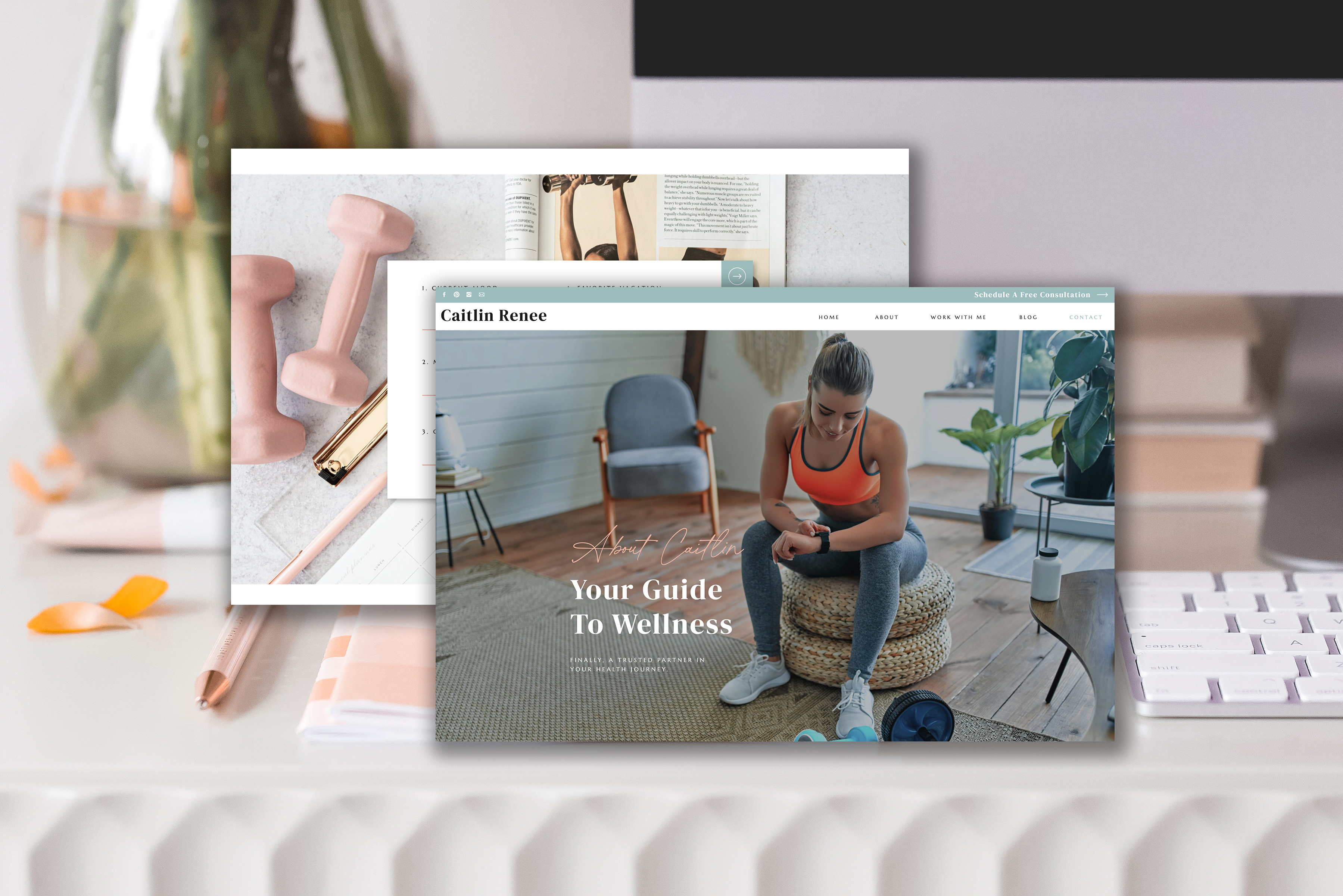
You’ve got your new website up and running, which is AWESOME. But how do you know it’s actually going to convert your visitors into leads and leads into buyers?
Let’s break down how you can make sure you have a homepage that converts for your business.
Make sure to download the swipe file at the end that includes a graphic framework and a checklist that will help you achieve this!
The goal of your homepage should be the following:
- Define who you are there to serve.
- Explain and relate to the problem your ideal client is facing that caused them to find you.
- Relay how exactly you are going to help them and showcase how you have helped people just like them.
If your website is not expressing these items right away, then you will want to revisit your brand message and copy to make sure you are explaining these items clearly and quickly. People need to see these items within a few seconds of landing on your website.
Must have components of a homepage that converts

Clear Headline
This means that when a person happens upon your page, they know exactly what you can do for them in a clear, concise message or one-liner. Less is more when it comes to marketing and a creating a strategic website.
People do not read websites anymore, they don’t have the time or patience. You want to capture their attention instantly so that they know whether they could use your service or not.
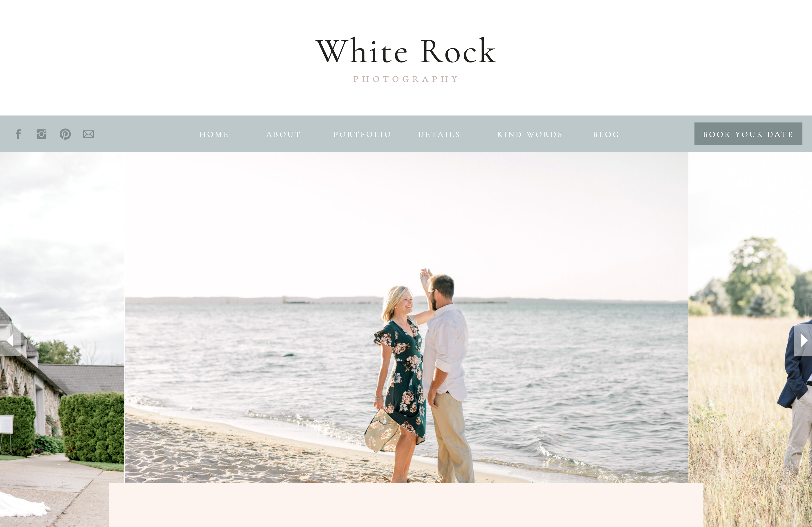
Examples would be: A business coach provides the resources and knowledge for you to grow your business and quit your day job. A wedding photographer captures the details you’ll never want to forget about your wedding day. A interior designer wants to create such a beautiful space for you so that you’ll never want to leave.
You want this message to be front and center when a person arrives on your website. And you want it to be in layman’s terms. Don’t use fancy, industry specific words that your ideal client might not know. And under this awesome, easy to understand tagline – provide a call to action so they can immediately get in touch with you.

Book Now // Buy Now Button
If possible, having a buy now, book now, book a call, get scheduled, whatever is an appropriate call to action for you business in the top right corner or front and center (above the fold) is a smart move. This allows it to be easily seen and easily found. You want your visitors to know exactly what you want them to do at all times. Similar to your standard call to action inside your homepage structure, this button is a call to action that can be powerful and you do not need to be timid about having it in multiple places.
You have an amazing offer and solution to your ideal client’s problem and you need to be shouting it. Who wouldn’t want to better their life? Just know that it’s doubtful you will be overselling your services – most people undersell by far and you’ll stand out by being confident in your offer.

State the Problem
Talk about the problem that your visitor is having and what made them seek you out. Relate to their pain points in some way and show that you understand their story.
Your homepage should be about them, if you keep that in mind, you are always going to be on the right path.So as you think of their pain points go through these questions – what are they struggling with? What is it that is holding them back from investing in you or someone else? What are the emotional aspects that are coming from their problem.
For example, the lack of a good website is causing them to not only book the clients they want, but is causing them to have a lack of confidence and a feeling of website shame that can easily be remedied by my solution, which is next on the list.

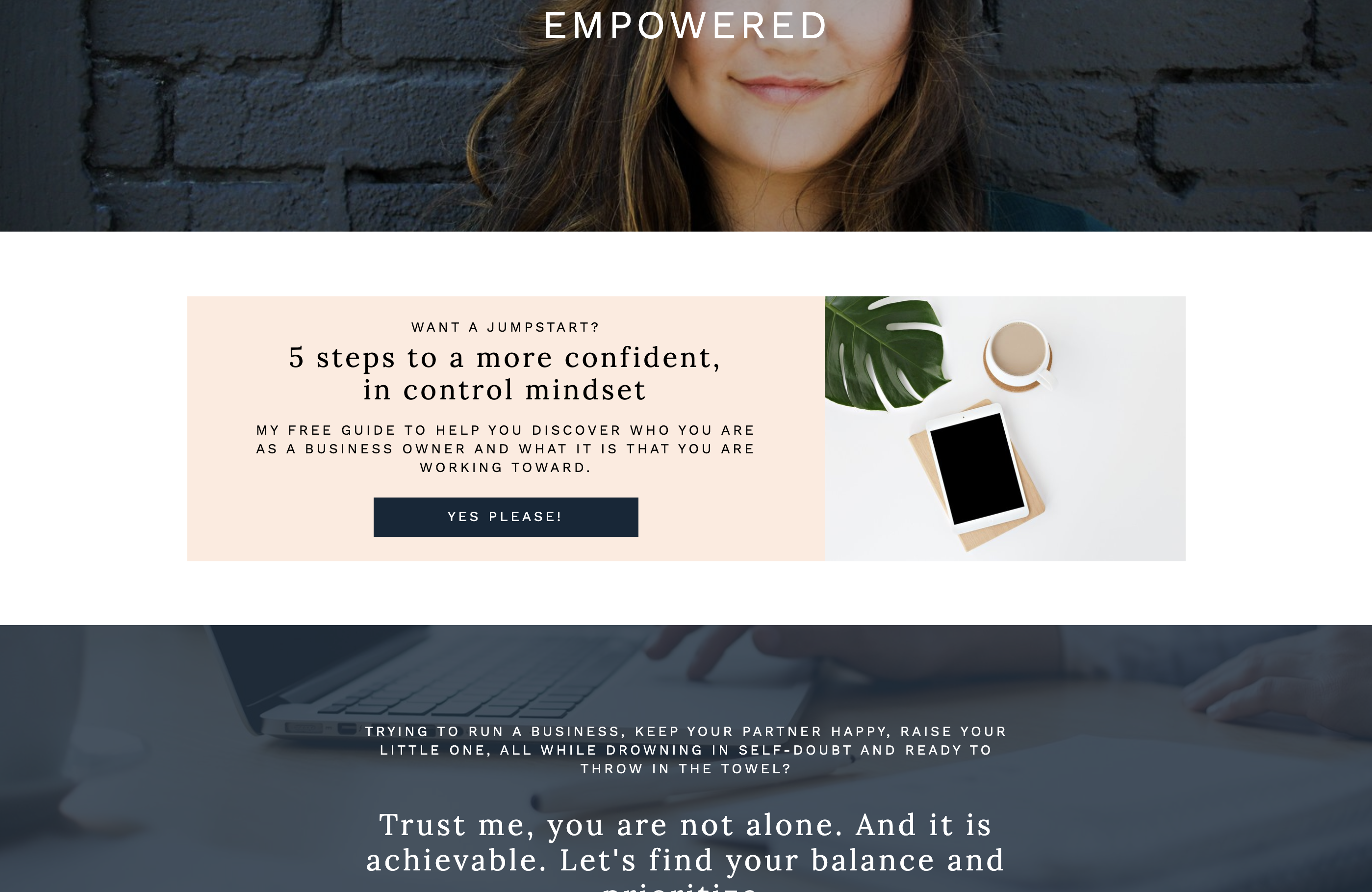
Lead Magnet or Email Opt-In
You’ve heard it a thousand times… you need to build your email list.
Why? Because you own your list and it’s your path of direct communication with your ideal audience. Having an email sign up on your website is a must and let’s do better than a simple “sign up for my newsletter.”
At this point in the customer journey they are looking for you to provide value to them in order to earn their trust (and their business potentially). Create a freebie or offer that they’ll happily exchange their email for! Make sure to have your freebie on brand and provide valuable content if you want to truly start building that relationship.
Social Proof & Testimonials
You want it to be clear that you are offering a solution to your ideal client, and you want them to know that it is a successful solution and has been vetted by other people just like them.
Having testimonials and feedback scattered throughout your site is a must to help give visitors a sense of security around working with you.
Provide affirmation through testimonials – keep them short and sweet and best of all, don’t focus on the praise about YOU personally and how awesome you are, focus on the testimonial sections that talk about the results people have achieved through your help. Check out this post for tips of getting quality feedback that you can use!
That’s what people want to know. That’s what matters to their story. They don’t need to visualize you as the hero in their story, they need to visualize you as the person that will help them be the hero.
Introduce the Solution & Yourself
What are you providing that is going to help make their life better?
List it out if you can or keep it simple and readable, not overwhelming. The idea is for them to read your solution and think to themselves, yes she get’s me and she can solve my problem. This is where you can show how you stand out from the competition.
Show why your offer is the RIGHT solution and how by choosing you, your product or your services, the visitor’s physical need will not only be taken care – needing a website, photography services, business coaching – but their underlying emotional need will be taken care of as well. Your homepage is your first impression to many people, so show how you can make a difference.

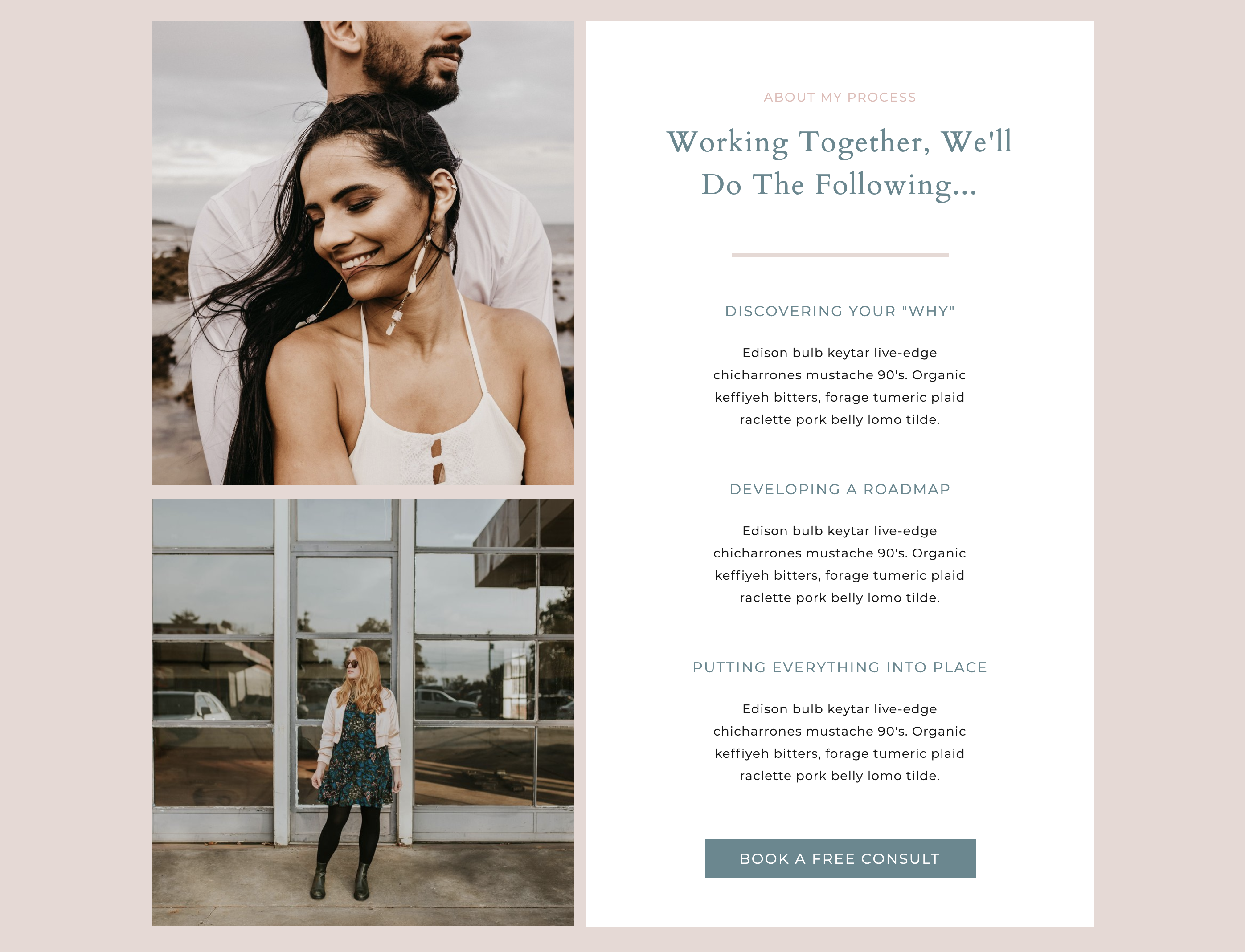
About The Process
This is a great way to show make things simple for your visitor. Everyone wants to know the jist of things. They want to know how simple it is to work with you or how simple using your product is. This is where you can highlight the steps involved and give your visitors the confidence they need to take action.
This can be as simple as the steps it takes to book with you. Or the steps they’ll take after buying your product that will lead them to a happier / healthier person.
Highlight the Benefits & Call to Action
Touch on the benefits again of working with you or using your product near the end of your page. This will be a summary of why they need to take action and provide a clear button for them to do so! Whether the next step is to book a call, buy your product or view your services, make sure they understand where they should go from here.
Never leave a dead-end at the bottom of a page.
Have another email opt-in is a great idea as well to capture their attention and have them more likely to sign up as you’ve built up the know/like/trust factor as they’ve gone through your homepage journey.