A sales page that doesn’t convert isn’t usually a copy problem or a traffic problem. More often it’s a design and structure problem — the page isn’t guiding the visitor in the right direction, or it’s asking them to make a decision before they’re ready.
Good sales page design does two things at once: it communicates the value of what you’re offering clearly, and it removes the friction standing between a visitor and a yes. These ten elements are what make that happen.
1. A headline that leads with the outcome
Your headline is the first thing a visitor reads, and it determines whether they keep reading or leave. Most headlines lead with the offer — what the thing is. The stronger approach is to lead with the outcome — what the visitor gets or experiences as a result.
“A 12-week business coaching program” tells someone what you’re selling. “Land your first premium client in 90 days” tells them what changes for them. The second one earns the next scroll.
Your headline should be specific, clear, and written in language your ideal client would actually use. Avoid jargon, clever wordplay that obscures meaning, or anything that makes someone work to understand what you’re offering.
2. A subheadline that adds context
The headline grabs attention. The subheadline holds it. Use this space to add one layer of detail — who the offer is for, what makes it different, or a secondary benefit that supports the headline.
Together, your headline and subheadline should answer the visitor’s first two questions: what is this, and is it for me? If someone can answer both within the first ten seconds on the page, you’ve done your job.
3. A clear problem statement
Before you explain your offer, name the problem it solves. This is one of the most important elements of sales page design and one of the most commonly skipped.
When someone reads your problem statement and thinks “yes, that’s exactly where I am” — you’ve established that you understand them. That sense of being understood is what makes everything that follows feel relevant rather than generic.
Be specific. “You’re tired of feeling overwhelmed” is vague. “You’ve been putting off your website for six months because every time you sit down to work on it, you don’t know where to start” is specific. The more precisely you name the situation, the more your ideal client feels like you wrote this page for them.
4. A benefit-focused offer description
Once you’ve established the problem, explain your offer — but frame it around benefits, not features. Features describe what something is. Benefits describe what it does for the person.
Feature: “Six modules of video content.” Benefit: “A step-by-step process you can work through at your own pace and come back to whenever you need it.”
Both say roughly the same thing, but the second one is what a potential buyer actually cares about. Go through your offer description and ask “so what?” after every feature. The answer to that question is the benefit.
5. Social proof placed strategically throughout
Testimonials work hardest when they’re placed at the moment a visitor needs reassurance — not grouped together on one section of the page that many people will skip.
The most effective sales page design weaves social proof throughout: a strong testimonial near the top to establish credibility early, one or two near the offer details to address specific objections, and another near the CTA to give a final push of confidence.
When selecting testimonials, choose ones that speak to outcomes and transformation rather than experience alone. “Working with Jessica was so easy and fun” is pleasant. “I launched my site in a week and booked two inquiries the first month” is persuasive. Both matter, but the second one does more work on a sales page.
6. An honest FAQ section
A well-written FAQ section isn’t just a list of logistics — it’s an objection-handling tool. Think about the questions a genuinely interested person would ask before buying, and answer them directly and honestly.
Common objections worth addressing: Is this right for me? What if I’m not happy with it? How long will this take? What do I need to have in place before I start?
Answering these questions clearly builds trust and removes friction. Avoiding them — or giving vague answers — plants doubt. An honest FAQ, including acknowledgment of who this isn’t right for, actually increases conversions because it demonstrates confidence in the offer.
7. A clear, specific call to action
Your CTA should be impossible to miss and easy to understand. That means a button that stands out visually from the rest of the page, placed multiple times throughout (not just at the bottom), with language that tells the visitor exactly what happens when they click.
“Buy now” is fine. “Book your spot” is better. “Get instant access” or “Start your application” are more specific and communicate what the next step actually is.
One CTA per page. If you have multiple offers or multiple next steps, your sales page is doing too much. Each sales page should have one offer and one action.
8. Visual hierarchy that guides the eye
Sales page design is about directing attention. Every section of the page should have a clear visual hierarchy — a main point the eye lands on first, supporting detail that follows, and a logical flow that moves the visitor downward.
In practice this means: your most important text (headlines, CTAs) should be the largest and most visually prominent. Supporting copy should be smaller and less visually heavy. Images should support the message of the section they’re in, not compete with it.
If everything on your page feels equally important, nothing feels important. Use size, weight, color, and spacing to create a clear order of priority.
9. Urgency that’s honest
Urgency — a reason to act now rather than later — is a legitimate and effective element of sales page design when it’s real. A genuine enrollment deadline, a limited number of spots, a bonus that expires — these create urgency that’s earned.
What doesn’t work, and actively damages trust, is false urgency. Countdown timers that reset. “Only 3 spots left” that’s been on the page for six months. Visitors notice these things more than you might think, and once trust is broken on a sales page, it’s very hard to recover.
If you don’t have genuine urgency to offer, don’t manufacture it. A clear value proposition and strong social proof will do more for your conversion rate than fake scarcity.
10. A design that loads fast and looks good on mobile
This is the element most people treat as an afterthought, but it matters more than almost anything else on this list. A sales page that loads slowly will lose a significant percentage of visitors before they’ve read a single word. A sales page that looks broken on mobile will lose even more.
Optimize your images before uploading them. Keep video embeds minimal. And test your page on an actual phone — not just the mobile preview in your editor — before you publish.
Your potential buyers are often discovering you on their phones. The sales page design experience on mobile should be just as intentional as on desktop.
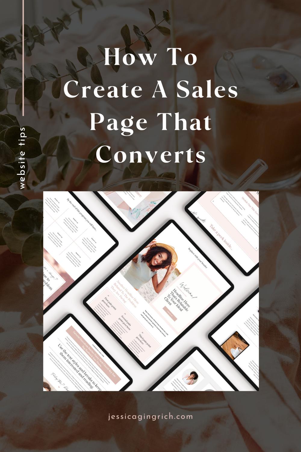
A starting point that already has the structure built in
If you’re building a sales page from scratch, getting all ten of these elements right while also managing the design is a lot to hold at once. That’s why I designed the sales page templates in the shop specifically with this structure in mind — the layout, hierarchy, and section flow are already set up to guide visitors through each of these elements in the right order.
You add your content. The design does the rest.
Browse Showit Sales Page Templates →